
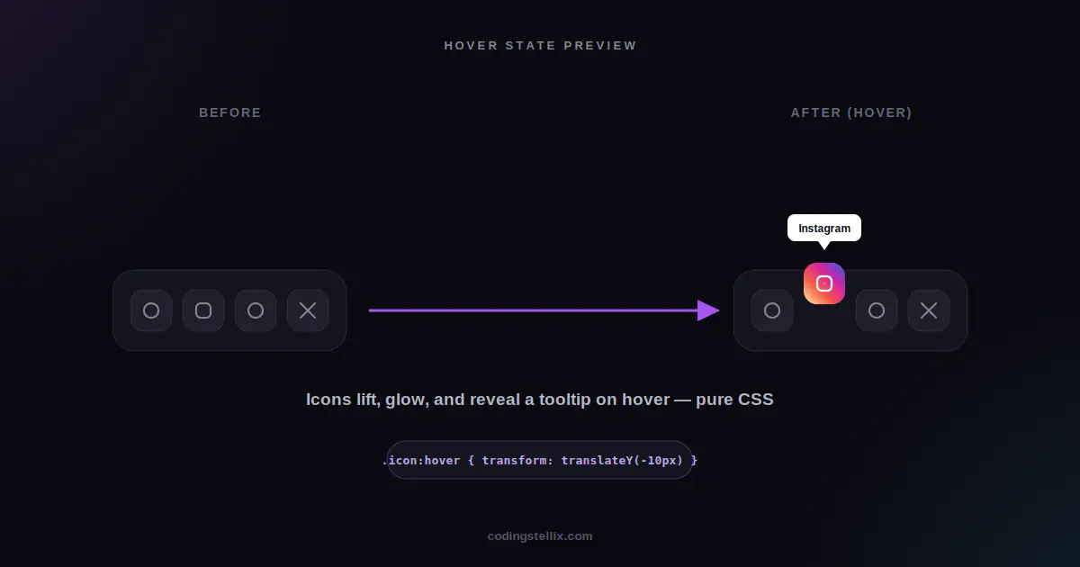
A row of social media icons sits at the bottom of nearly every website, and most of the time nobody notices them at all. They’re small, they’re gray, and clicking one feels like an afterthought. A dock of icons that gently rises into view, lifts and glows under the cursor, and shows a friendly little label above each one changes that completely — suddenly the smallest part of the page becomes something people actually enjoy interacting with. This walkthrough breaks down exactly how that effect is built, using nothing but HTML and CSS.
What We’re Building
Picture a small floating panel with a frosted glass appearance, holding six rounded icon squares in a row. When the page loads, the icons don’t all appear at once — they rise into place one after another, like dominoes settling. Hovering over any single icon makes it lift upward, scale up slightly, tilt with a small rotation, and glow with that platform’s own brand color. A small label pops up above the icon at the same time, telling you exactly what it is, complete with a tiny arrow pointing down to the icon itself.
Every part of this is achievable with plain CSS. No JavaScript library, no animation framework, no icon font — even the icons themselves are inline vector shapes that scale perfectly at any size.
Building the Glass Panel
The frosted glass look, often called glassmorphism, comes from three CSS properties working together. A semi-transparent background color lets whatever is behind the panel show through faintly. A backdrop blur filter takes that background and blurs it, which is what actually creates the “frosted” texture rather than just a plain transparent box. And a thin, barely-visible border along the edge gives the glass a sense of physical thickness, the way real glass catches a rim of light along its edge.
Layered on top of those three, a soft drop shadow underneath the whole panel lifts it visually off the page, and a subtle inner highlight along the top edge — created with an inset box-shadow — mimics the way light glances off the top of a curved glass surface. None of these individually look like much, but together they produce a convincing sense of a solid, tactile object floating above the background rather than a flat rectangle.
Making the Icons Rise Into Place
The staggered entrance is one of the more satisfying details, and it’s also one of the simplest to build. Every icon starts in a slightly lower position with zero opacity, and each one animates upward into its natural position with full opacity. The trick that makes it look staggered rather than simultaneous is giving each icon a slightly longer animation delay than the one before it — the first icon starts almost immediately, the second waits a fraction of a second longer, the third a little longer still, and so on down the row.
Because each icon is a separate element, each one can be given its own delay using nothing more than a position-based selector, without writing any JavaScript to orchestrate the timing. The result reads as a single coordinated motion, even though it’s really six completely independent animations that simply started at slightly different moments.
The Hover State: Lift, Glow, and a Touch of Personality
When the cursor lands on an icon, several things happen at once, each handled by its own CSS transition so they all animate smoothly rather than snapping. The icon itself moves upward and grows slightly larger, giving it a sense of coming toward the viewer. A small rotation is added on top of that movement — just a few degrees — which keeps the motion from feeling stiff or mechanical.
Behind the icon’s symbol, a colored layer fades in, using each platform’s actual brand color or gradient. Instagram’s icon uses its real four-color gradient rather than a single flat color, since a flat Instagram icon always looks slightly wrong to anyone familiar with the brand. A matching colored shadow glows beneath the icon at the same time, so the glow visually agrees with whatever color just faded in behind the icon shape.
The icon symbol itself, drawn in a muted gray by default, switches to solid white the moment the background color appears behind it, keeping it clearly visible against every brand color in the set. Getting this contrast right matters more than it might seem — a hover effect that makes an icon harder to see, even briefly, undermines the whole effort.
Adding the Tooltip Label
The floating label above each icon is built using a CSS pseudo-element rather than a separate HTML tag, which keeps the markup clean. The pseudo-element pulls its text directly from a custom data attribute set on the icon itself, so the same block of CSS works for every icon in the row without needing six almost-identical blocks of styling repeated over and over.
By default, the label sits invisible and slightly lower than its final position. On hover, it fades in while sliding upward into place, arriving at the same moment the icon itself finishes lifting. A tiny triangle, built from a zero-width, zero-height element with only its borders visible, sits just below the label and points down toward the icon, giving the label the familiar look of a tooltip rather than a random floating box.
A Few Details That Make It Feel Finished
A couple of smaller touches round out the effect. Every icon gets a visible focus outline for anyone navigating the dock with a keyboard rather than a mouse, since a hover-only effect that ignores keyboard users leaves part of the audience behind. A slightly compressed, scaled-down state is applied the instant an icon is clicked, giving a small satisfying “press” feeling before the link actually navigates anywhere. And every one of these transitions is wrapped so that people who’ve asked their device to reduce motion get a calmer, animation-free version instead — a small addition that costs almost nothing and matters a great deal to the people who need it.
Why This Pattern Is Worth Reusing
Glassmorphic panels, staggered entrances, and hover tooltips each show up constantly across modern web design, well beyond just a row of social icons. The same frosted-glass technique works for navigation bars, card layouts, and modal windows. The same staggered-delay trick works for any row or grid of elements that should feel like they’re arriving together rather than appearing all at once. And the same tooltip pattern, built from a pseudo-element and a data attribute, works for labeling any small icon-only control where a full visible label would take up too much space.
The complete example lives in a single self-contained HTML file — open it, hover over each icon, and look at how the individual pieces stack together to create the finished effect. There’s nothing hidden behind a build process or a framework here, just HTML and CSS doing the work in plain sight.
<!DOCTYPE html>
<html lang="en">
<head>
<meta charset="UTF-8">
<meta name="viewport" content="width=device-width, initial-scale=1.0">
<title>Social Icons Hover Effect | Coding Stellix</title>
<link href="https://fonts.googleapis.com/css2?family=Jost:wght@400;500;600;700&display=swap" rel="stylesheet">
<style>
  *{margin:0;padding:0;box-sizing:border-box}
  body{
    min-height:100vh;
    display:flex;align-items:center;justify-content:center;
    background:
      radial-gradient(600px 400px at 20% 20%, rgba(168,85,247,.14), transparent 60%),
      radial-gradient(600px 400px at 80% 80%, rgba(56,189,248,.12), transparent 60%),
      #0a0a10;
    font-family:'Jost',sans-serif;
    overflow:hidden;
  }

  .dock{
    display:flex;gap:8px;
    padding:18px 22px;
    background:rgba(255,255,255,.05);
    border:1px solid rgba(255,255,255,.12);
    border-radius:28px;
    backdrop-filter:blur(20px);
    box-shadow:0 25px 60px rgba(0,0,0,.5), inset 0 1px 0 rgba(255,255,255,.08);
  }

  .icon{
    position:relative;
    width:60px;height:60px;
    border-radius:18px;
    background:rgba(255,255,255,.04);
    border:1px solid rgba(255,255,255,.08);
    display:flex;align-items:center;justify-content:center;
    cursor:pointer;
    text-decoration:none;
    opacity:0;
    transform:translateY(14px);
    animation:enter .55s cubic-bezier(.2,.8,.2,1) forwards;
    transition:transform .35s cubic-bezier(.34,1.56,.64,1), background .35s ease, border-color .35s ease, box-shadow .35s ease;
  }
  .icon:nth-child(1){animation-delay:.05s}
  .icon:nth-child(2){animation-delay:.12s}
  .icon:nth-child(3){animation-delay:.19s}
  .icon:nth-child(4){animation-delay:.26s}
  .icon:nth-child(5){animation-delay:.33s}
  .icon:nth-child(6){animation-delay:.40s}

  @keyframes enter{
    to{opacity:1;transform:translateY(0)}
  }

  .icon svg{
    width:24px;height:24px;
    fill:#cfcfe0;
    transition:fill .3s ease, transform .35s cubic-bezier(.34,1.56,.64,1);
    position:relative;z-index:2;
  }

  .icon::before{
    content:"";
    position:absolute;inset:0;
    border-radius:inherit;
    opacity:0;
    transition:opacity .35s ease;
    z-index:1;
  }

  /* tooltip label */
  .icon::after{
    content:attr(data-label);
    position:absolute;
    bottom:calc(100% + 12px);
    left:50%;
    transform:translateX(-50%) translateY(6px) scale(.85);
    background:#fff;
    color:#0a0a10;
    font-size:.72rem;
    font-weight:700;
    padding:6px 12px;
    border-radius:8px;
    white-space:nowrap;
    opacity:0;
    pointer-events:none;
    transition:opacity .25s ease, transform .25s ease;
    z-index:5;
  }
  /* little tooltip arrow */
  .icon .tip-arrow{
    position:absolute;
    bottom:calc(100% + 7px);
    left:50%;
    transform:translateX(-50%) scale(.85);
    width:0;height:0;
    border-left:5px solid transparent;
    border-right:5px solid transparent;
    border-top:5px solid #fff;
    opacity:0;
    transition:opacity .25s ease, transform .25s ease;
    z-index:5;
  }

  .icon:hover{
    transform:translateY(-10px) scale(1.08);
    border-color:transparent;
  }
  .icon:hover::before{opacity:1}
  .icon:hover svg{fill:#fff;transform:scale(1.1) rotate(-6deg)}
  .icon:hover::after{opacity:1;transform:translateX(-50%) translateY(0) scale(1)}
  .icon:hover .tip-arrow{opacity:1;transform:translateX(-50%) scale(1)}

  .icon.fb::before{background:linear-gradient(135deg,#1877f2,#0e5fd1)}
  .icon.fb:hover{box-shadow:0 16px 30px rgba(24,119,242,.4)}

  .icon.ig::before{background:radial-gradient(circle at 30% 110%,#fdf497,#fd5949 35%,#d6249f 60%,#285AEB 100%)}
  .icon.ig:hover{box-shadow:0 16px 30px rgba(214,36,159,.4)}

  .icon.yt::before{background:linear-gradient(135deg,#ff0000,#cc0000)}
  .icon.yt:hover{box-shadow:0 16px 30px rgba(255,0,0,.35)}

  .icon.x::before{background:linear-gradient(135deg,#2b2b2b,#000)}
  .icon.x:hover{box-shadow:0 16px 30px rgba(255,255,255,.18)}

  .icon.wa::before{background:linear-gradient(135deg,#25d366,#1da851)}
  .icon.wa:hover{box-shadow:0 16px 30px rgba(37,211,102,.4)}

  .icon.gh::before{background:linear-gradient(135deg,#8957e5,#6e40c9)}
  .icon.gh:hover{box-shadow:0 16px 30px rgba(137,87,229,.4)}

  .icon:active{transform:translateY(-6px) scale(.98)}

  .icon:focus-visible{
    outline:2px solid #fff;
    outline-offset:4px;
  }

  @media (prefers-reduced-motion: reduce){
    .icon{animation:none;opacity:1;transform:none}
    .icon, .icon::before, .icon::after, .icon svg, .tip-arrow{transition:none}
  }

  @media(max-width:480px){
    .dock{gap:5px;padding:14px 16px;border-radius:22px}
    .icon{width:48px;height:48px;border-radius:14px}
    .icon svg{width:20px;height:20px}
  }
</style>
</head>
<body>

  <div class="dock">
    <a class="icon fb" href="#" aria-label="Facebook" data-label="Facebook">
      <span class="tip-arrow"></span>
      <svg viewBox="0 0 24 24"><path d="M22 12.06C22 6.5 17.52 2 12 2S2 6.5 2 12.06c0 5 3.66 9.15 8.44 9.94v-7.03H7.9v-2.9h2.54V9.86c0-2.51 1.49-3.9 3.77-3.9 1.09 0 2.24.2 2.24.2v2.46h-1.26c-1.24 0-1.63.77-1.63 1.56v1.88h2.78l-.44 2.9h-2.34V22c4.78-.79 8.44-4.93 8.44-9.94z"/></svg>
    </a>
    <a class="icon ig" href="#" aria-label="Instagram" data-label="Instagram">
      <span class="tip-arrow"></span>
      <svg viewBox="0 0 24 24"><path d="M12 2.16c3.2 0 3.58.01 4.85.07 1.17.05 1.97.24 2.43.4a4.9 4.9 0 0 1 1.77 1.15 4.9 4.9 0 0 1 1.15 1.77c.16.46.35 1.26.4 2.43.06 1.27.07 1.65.07 4.85s-.01 3.58-.07 4.85c-.05 1.17-.24 1.97-.4 2.43a4.9 4.9 0 0 1-1.15 1.77 4.9 4.9 0 0 1-1.77 1.15c-.46.16-1.26.35-2.43.4-1.27.06-1.65.07-4.85.07s-3.58-.01-4.85-.07c-1.17-.05-1.97-.24-2.43-.4a4.9 4.9 0 0 1-1.77-1.15 4.9 4.9 0 0 1-1.15-1.77c-.16-.46-.35-1.26-.4-2.43C2.17 15.58 2.16 15.2 2.16 12s.01-3.58.07-4.85c.05-1.17.24-1.97.4-2.43a4.9 4.9 0 0 1 1.15-1.77A4.9 4.9 0 0 1 5.55 1.8c.46-.16 1.26-.35 2.43-.4C9.25 1.34 9.63 1.33 12 1.33zM12 0C8.74 0 8.33.01 7.05.07c-1.28.06-2.15.26-2.91.56a6.9 6.9 0 0 0-2.5 1.63 6.9 6.9 0 0 0-1.63 2.5c-.3.76-.5 1.63-.56 2.9C-.01 8.33 0 8.74 0 12s.01 3.67.07 4.95c.06 1.28.26 2.15.56 2.91a6.9 6.9 0 0 0 1.63 2.5 6.9 6.9 0 0 0 2.5 1.63c.76.3 1.63.5 2.9.56 1.28.06 1.69.07 4.95.07s3.67-.01 4.95-.07c1.28-.06 2.15-.26 2.91-.56a6.9 6.9 0 0 0 2.5-1.63 6.9 6.9 0 0 0 1.63-2.5c.3-.76.5-1.63.56-2.9.06-1.28.07-1.69.07-4.95s-.01-3.67-.07-4.95c-.06-1.28-.26-2.15-.56-2.91a6.9 6.9 0 0 0-1.63-2.5A6.9 6.9 0 0 0 19.95.63c-.76-.3-1.63-.5-2.9-.56C15.67.01 15.26 0 12 0zm0 5.84A6.16 6.16 0 1 0 18.16 12 6.16 6.16 0 0 0 12 5.84zm0 10.16A4 4 0 1 1 16 12a4 4 0 0 1-4 4zm6.41-10.4a1.44 1.44 0 1 1-1.44-1.44 1.44 1.44 0 0 1 1.44 1.44z"/></svg>
    </a>
    <a class="icon yt" href="#" aria-label="YouTube" data-label="YouTube">
      <span class="tip-arrow"></span>
      <svg viewBox="0 0 24 24"><path d="M23.5 6.19a3.02 3.02 0 0 0-2.12-2.14C19.5 3.5 12 3.5 12 3.5s-7.5 0-9.38.55A3.02 3.02 0 0 0 .5 6.19 31.6 31.6 0 0 0 0 12a31.6 31.6 0 0 0 .5 5.81 3.02 3.02 0 0 0 2.12 2.14c1.88.55 9.38.55 9.38.55s7.5 0 9.38-.55a3.02 3.02 0 0 0 2.12-2.14A31.6 31.6 0 0 0 24 12a31.6 31.6 0 0 0-.5-5.81zM9.6 15.6V8.4l6.27 3.6z"/></svg>
    </a>
    <a class="icon x" href="#" aria-label="X (Twitter)" data-label="X / Twitter">
      <span class="tip-arrow"></span>
      <svg viewBox="0 0 24 24"><path d="M18.24 2h3.4l-7.43 8.49L23 22h-6.9l-5.4-7.06L4.5 22H1.1l7.94-9.08L1 2h7.06l4.88 6.45zm-1.2 18.02h1.88L7.06 3.88H5.04z"/></svg>
    </a>
    <a class="icon wa" href="#" aria-label="WhatsApp" data-label="WhatsApp">
      <span class="tip-arrow"></span>
      <svg viewBox="0 0 24 24"><path d="M17.5 14.4c-.3-.15-1.77-.87-2.04-.97-.27-.1-.47-.15-.67.15-.2.3-.77.97-.94 1.17-.17.2-.35.22-.65.07-.3-.15-1.26-.46-2.4-1.48-.9-.8-1.5-1.78-1.68-2.08-.17-.3-.02-.46.13-.61.14-.14.3-.35.45-.52.15-.17.2-.3.3-.5.1-.2.05-.37-.02-.52-.07-.15-.67-1.6-.9-2.2-.24-.58-.5-.5-.68-.5h-.58c-.2 0-.52.07-.8.37-.27.3-1.04 1.02-1.04 2.48 0 1.46 1.07 2.87 1.22 3.07.15.2 2.1 3.2 5.1 4.49.71.3 1.27.49 1.7.62.72.23 1.37.2 1.88.12.57-.08 1.77-.72 2.02-1.42.25-.7.25-1.3.17-1.42-.07-.13-.27-.2-.57-.35zM12.04 2C6.5 2 2 6.48 2 12c0 1.85.5 3.6 1.4 5.1L2 22l5.08-1.34A9.9 9.9 0 0 0 12.04 22C17.6 22 22 17.52 22 12S17.6 2 12.04 2z"/></svg>
    </a>
    <a class="icon gh" href="#" aria-label="GitHub" data-label="GitHub">
      <span class="tip-arrow"></span>
      <svg viewBox="0 0 24 24"><path d="M12 .5C5.65.5.5 5.65.5 12c0 5.08 3.29 9.39 7.86 10.91.57.1.79-.25.79-.55v-2.15c-3.2.7-3.87-1.36-3.87-1.36-.53-1.34-1.29-1.7-1.29-1.7-1.06-.72.08-.7.08-.7 1.17.08 1.78 1.2 1.78 1.2 1.03 1.77 2.71 1.26 3.38.96.1-.75.4-1.26.73-1.55-2.55-.29-5.24-1.28-5.24-5.68 0-1.26.45-2.28 1.19-3.08-.12-.29-.52-1.47.11-3.06 0 0 .97-.31 3.18 1.18a11.05 11.05 0 0 1 5.8 0c2.2-1.49 3.17-1.18 3.17-1.18.63 1.6.23 2.77.12 3.06.74.8 1.18 1.82 1.18 3.08 0 4.41-2.7 5.38-5.26 5.67.42.36.78 1.06.78 2.15v3.18c0 .3.21.66.79.55A10.51 10.51 0 0 0 23.5 12C23.5 5.65 18.35.5 12 .5z"/></svg>
    </a>
  </div>

</body>
</html>