
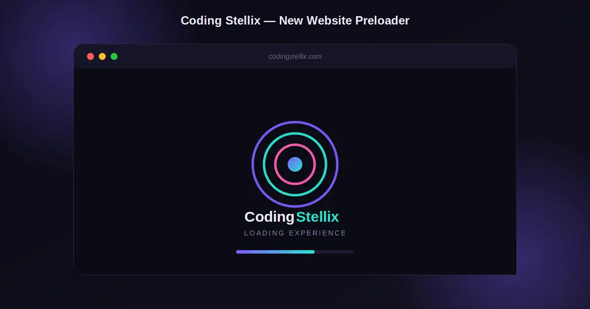
If you have ever opened a website and seen a small spinning animation before the page fully appears, that is called a preloader. It is a small design detail, but it makes a huge difference in how professional a website feels. At Coding Stellix, we get asked about this a lot, so today I am going to walk you through exactly how to build one from scratch, using nothing but plain HTML and CSS.
You do not need any JavaScript library, animation plugin, or heavy framework for this. A preloader can be built with a handful of divs, a bit of CSS animation, and a small script to hide it once the page loads. That is the beauty of it — it is lightweight, fast, and works on every website, whether it is built on plain HTML, WordPress, or any other platform.
What Is a Preloader and Why Does It Matter
A preloader is the screen that shows up first, right before your actual website content appears. Its main job is to keep the visitor engaged for those one or two seconds while images, fonts, and scripts are still loading in the background. Instead of showing a blank white screen, you show a smooth animation with your brand name on it.
This matters more than people think. A blank screen makes visitors think the site is broken or slow. A well designed preloader, on the other hand, gives the impression that something is happening, and it also gives your brand a few extra seconds of visibility before the user even reaches your homepage. For a brand like Coding Stellix, that first impression is important, because it sets the tone for the rest of the site.
Planning the Design Before Writing Code
Before touching any code, it helps to decide on a few things. First, pick a color scheme that matches your brand. For this project, instead of sticking to the usual orange tones, we went with a fresh violet, cyan, and pink gradient combination on a dark background. This gives the loader a more premium and modern feel while still keeping it different from the main brand colors, so it stands out as its own visual moment.
Second, decide on the animation style. There are many options — a simple spinner, a progress bar, a bouncing logo, or in this case, a multi ring orbit animation with a glowing core in the center. The orbit style works well because it feels alive without being distracting, and it does not require any images or external assets.
Third, think about timing. A preloader should never overstay its welcome. If it shows for too long, it becomes annoying instead of helpful. A short animation of one to two seconds, combined with a fade out transition, feels natural and does not frustrate the visitor.
Building the HTML Structure
The HTML part is very simple. You need one main wrapper div that sits on top of everything else on the page. Inside that wrapper, you place the animation elements — in this case, three rings of different sizes, a small glowing circle in the middle, the brand name text, a tagline, and a thin progress bar underneath. That is really all the markup you need. There is no need for extra libraries or complicated nested structures.
The key part of the HTML setup is making sure this preloader div is placed right at the very beginning of the body tag, before any other content. This way, it is the first thing that renders on the screen, covering the rest of the page while everything else loads behind it.
Styling With CSS
This is where most of the work happens. The wrapper is given a fixed position that covers the entire screen, with a high z-index so it always sits above every other element. The background uses a dark base color with two soft radial gradient glows placed in opposite corners, which gives the loader some depth instead of looking flat.
For the animation itself, each ring is a circle built using CSS borders, where only two sides of the border are colored and the rest are transparent. By rotating this shape continuously using a CSS keyframe animation, it creates the illusion of a spinning arc. Layering three of these rings on top of each other, each with a different size, color, speed, and rotation direction, produces a much more interesting effect than a single spinner would.
The glowing circle in the center uses a soft box shadow along with a gentle scale animation, so it pulses in and out slightly, giving the whole thing a sense of energy at the core.
Below the animation, the brand name is styled with a gradient text effect, where part of the text uses a linear gradient as its color instead of a flat color. This is done using the background-clip property along with a transparent text color, and it is a nice touch that ties the loader back to your brand identity.
Finally, the progress bar at the bottom is just a small rounded rectangle with a moving gradient fill, animated with a simple keyframe that grows its width from zero to full over a couple of seconds.
Making It Responsive
Responsiveness matters just as much for a preloader as it does for the rest of your website, because visitors will be viewing it on phones, tablets, and desktops. The good news is that if you build it using relative units and flexbox for centering, most of the responsive behavior comes naturally.
The trick is to avoid fixed pixel widths for the outer wrapper, and instead let it stretch to fill the full screen using inset zero, combined with flexbox properties to keep the animation centered regardless of screen size. The inner elements, like the rings and text, can use fixed sizes since they are small enough that they look good across most screen widths, but if you want extra polish, you can add a media query that slightly reduces the ring sizes and font size on smaller screens.
Hiding the Preloader Once the Page Loads
The final piece is a small script that listens for the page load event. Once everything on the page has finished loading, the script adds a class to the preloader wrapper that triggers a CSS opacity and visibility transition, fading it out smoothly. After the transition finishes, the element can be removed from the page completely so it does not interfere with anything else.
Adding a short artificial delay before hiding the loader, even after the page technically finishes loading, is a common trick. This prevents the animation from flashing on screen for a fraction of a second on fast connections, which can look glitchy. Giving it a consistent minimum display time, even if the page loads instantly, makes the experience feel more intentional.
Final Thoughts
Building a preloader is one of those small projects that teaches you a lot about CSS animation, timing, and how to think about first impressions on a website. It does not require any complicated tools, just a solid understanding of positioning, keyframes, and gradients. Once you have one version working, it becomes very easy to reuse the same structure for future projects and simply swap out the colors, text, or animation style to match a new brand.
This is exactly the kind of small but impactful project Coding Stellix likes to share, because it is practical, beginner friendly, and something you can genuinely use on a real website today.
<!DOCTYPE html>
<html lang="en">
<head>
<meta charset="UTF-8">
<meta name="viewport" content="width=device-width, initial-scale=1.0">
<title>Coding Stellix — Preloader</title>
<link rel="preconnect" href="https://fonts.googleapis.com">
<link href="https://fonts.googleapis.com/css2?family=Jost:wght@400;500;600;700;800&display=swap" rel="stylesheet">
<style>
  :root{
    --bg: #0a0a14;
    --violet: #7b5cff;
    --violet-2: #b18cff;
    --cyan: #29e6d0;
    --pink: #ff5cb3;
    --text: #f2f0ff;
    --muted: #8b87a8;
  }

  *{ margin:0; padding:0; box-sizing:border-box; }

  html, body{
    height:100%;
    background: var(--bg);
    font-family: 'Jost', sans-serif;
    overflow:hidden;
  }

  /* ===== Preloader Overlay ===== */
  #stellix-preloader{
    position:fixed;
    inset:0;
    display:flex;
    flex-direction:column;
    align-items:center;
    justify-content:center;
    background:
      radial-gradient(circle at 20% 20%, rgba(123,92,255,0.18), transparent 45%),
      radial-gradient(circle at 80% 80%, rgba(41,230,208,0.15), transparent 45%),
      var(--bg);
    z-index:9999;
    transition: opacity 0.7s ease, visibility 0.7s ease;
  }

  #stellix-preloader.hidden{
    opacity:0;
    visibility:hidden;
    pointer-events:none;
  }

  /* ===== Orbit Loader ===== */
  .stellix-loader{
    position:relative;
    width:130px;
    height:130px;
    display:flex;
    align-items:center;
    justify-content:center;
    margin-bottom:38px;
  }

  .stellix-ring{
    position:absolute;
    border-radius:50%;
    border: 3px solid transparent;
  }

  .stellix-ring.r1{
    width:130px;
    height:130px;
    border-top-color: var(--violet);
    border-right-color: var(--violet);
    animation: spin 1.4s linear infinite;
  }

  .stellix-ring.r2{
    width:96px;
    height:96px;
    border-bottom-color: var(--cyan);
    border-left-color: var(--cyan);
    animation: spin-rev 1.1s linear infinite;
  }

  .stellix-ring.r3{
    width:62px;
    height:62px;
    border-top-color: var(--pink);
    border-left-color: var(--pink);
    animation: spin 0.9s linear infinite;
  }

  .stellix-core{
    width:22px;
    height:22px;
    border-radius:50%;
    background: linear-gradient(135deg, var(--violet), var(--cyan));
    box-shadow: 0 0 25px rgba(123,92,255,0.8), 0 0 45px rgba(41,230,208,0.5);
    animation: pulse 1.6s ease-in-out infinite;
  }

  @keyframes spin{ to{ transform: rotate(360deg); } }
  @keyframes spin-rev{ to{ transform: rotate(-360deg); } }
  @keyframes pulse{
    0%, 100%{ transform: scale(1); opacity:1; }
    50%{ transform: scale(1.25); opacity:0.75; }
  }

  /* ===== Brand Text ===== */
  .stellix-brand{
    font-size: 26px;
    font-weight: 700;
    letter-spacing: 1px;
    color: var(--text);
  }

  .stellix-brand span{
    background: linear-gradient(90deg, var(--violet-2), var(--cyan));
    -webkit-background-clip: text;
    background-clip: text;
    color: transparent;
  }

  .stellix-tagline{
    margin-top:10px;
    font-size:13px;
    letter-spacing: 3px;
    text-transform: uppercase;
    color: var(--muted);
  }

  /* ===== Progress Bar ===== */
  .stellix-progress-track{
    margin-top:30px;
    width:220px;
    height:4px;
    border-radius:10px;
    background: rgba(255,255,255,0.08);
    overflow:hidden;
  }

  .stellix-progress-fill{
    height:100%;
    width:0%;
    border-radius:10px;
    background: linear-gradient(90deg, var(--violet), var(--cyan), var(--pink));
    background-size: 200% 100%;
    animation: fillbar 2.2s ease forwards, gradientmove 2.2s linear infinite;
  }

  @keyframes fillbar{
    0%{ width:0%; }
    100%{ width:100%; }
  }

  @keyframes gradientmove{
    0%{ background-position: 0% 0%; }
    100%{ background-position: 200% 0%; }
  }

  /* ===== Demo page content behind preloader ===== */
  .stellix-demo-page{
    height:100%;
    display:flex;
    align-items:center;
    justify-content:center;
    color: var(--text);
    text-align:center;
    padding: 20px;
  }

  .stellix-demo-page h1{
    font-size: 32px;
    font-weight:700;
  }

  .stellix-demo-page p{
    color: var(--muted);
    margin-top:10px;
    font-size:15px;
  }
</style>
</head>
<body>

  <!-- PRELOADER -->
  <div id="stellix-preloader">
    <div class="stellix-loader">
      <div class="stellix-ring r1"></div>
      <div class="stellix-ring r2"></div>
      <div class="stellix-ring r3"></div>
      <div class="stellix-core"></div>
    </div>
    <div class="stellix-brand">Coding <span>Stellix</span></div>
    <div class="stellix-tagline">Loading Experience</div>
    <div class="stellix-progress-track">
      <div class="stellix-progress-fill"></div>
    </div>
  </div>

  <!-- PAGE CONTENT (shown after preload) -->
  <div class="stellix-demo-page">
    <div>
      <h1>Coding Stellix</h1>
      <p>Your website content goes here.</p>
    </div>
  </div>

  <script>
    // Hide preloader once page has fully loaded
    window.addEventListener('load', function () {
      setTimeout(function () {
        var preloader = document.getElementById('stellix-preloader');
        preloader.classList.add('hidden');
        setTimeout(function(){ preloader.remove(); }, 800);
      }, 1800); // minimum display time so animation is visible
    });
  </script>

</body>
</html>