
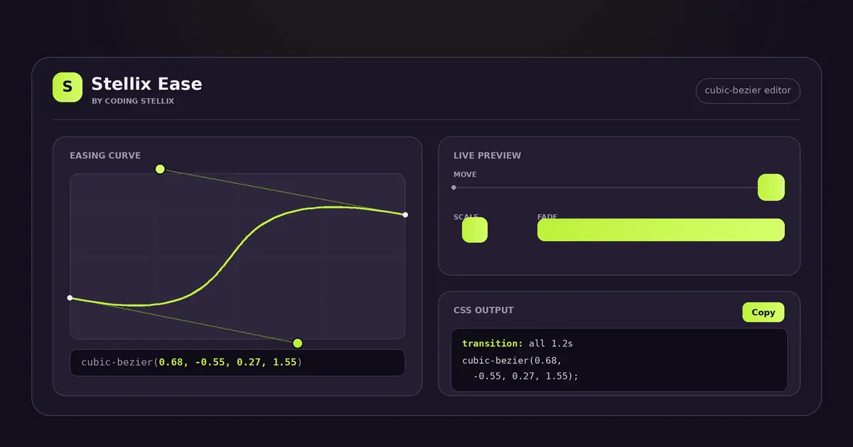
If you have ever built anything on the web, you already know the feeling. Your layout is clean, your colours are right, and then you add an animation and it just feels… off. The box moves, but it moves like a robot. The menu slides open, but it slides with all the grace of a filing drawer. Everything is technically working, yet nothing feels alive.
Nine times out of ten, the problem is not the animation itself. It is the easing — the way motion speeds up and slows down over time. And easing in CSS lives inside one small, intimidating function: cubic-bezier(). Four numbers, no obvious meaning, and almost impossible to guess by hand.
That is exactly the gap Stellix Ease was built to close. It is a free, visual cubic-bezier editor that turns those four mysterious numbers into something you can see, drag, and feel. You shape the curve with your mouse, watch a live preview react instantly, and copy the finished CSS straight into your project. No math, no guesswork, no endless refreshing.
Why easing is the secret ingredient
Motion in the real world is never linear. A ball dropped from your hand does not fall at a constant speed — it accelerates. A door you push does not stop dead — it eases into place. Our brains are tuned to this. When something on a screen moves at a perfectly even pace from start to finish, it reads as fake, even if we cannot explain why.
Easing is how you bring that natural feeling into a website. A gentle ease-out makes a card settle softly. A snappy curve makes a button feel responsive and quick. A slight overshoot makes an element bounce playfully into view. These tiny timing choices are the difference between an interface that feels cheap and one that feels considered and expensive.
The catch is that CSS gives you this power through numbers that are genuinely hard to picture. cubic-bezier(0.68, -0.55, 0.27, 1.55) describes a lovely bouncy motion, but reading those four values tells you almost nothing. You need to see the curve to understand it, and you need to watch it move to trust it.
What Stellix Ease actually does
Stellix Ease puts three things on one screen so you never have to hold the whole picture in your head.
A curve you can drag. In the middle of the editor sits a square grid with a curve running through it. The two coloured handles are yours to move. Pull them around and the curve reshapes in real time, and — this is the important part — the handles are allowed to travel outside the box. That is how you create overshoot and bounce, the curves where an element flies a little past its target before settling back. Most beginners do not even realise CSS can do this, and here it is one drag away.
A live preview that moves. Right beside the curve, three little demos loop endlessly using whatever easing you have set. One slides across a track, one scales up and down, and one fades in and out. Because they all share the same timing function, you instantly see how your curve behaves across different kinds of animation. A curve that looks great on a moving box might feel wrong on a fade — now you can check both before you commit.
The exact code, ready to copy. At the bottom, the tool writes out the CSS for you: both a full transition line and the animation-timing-function on its own. One tap on the copy button and it is on your clipboard. You paste it into your stylesheet and you are done.
There is also a duration slider so you can test your easing at the actual speed you plan to use — a curve feels very different at 0.4 seconds than it does at 2 seconds — and a set of presets to get you started, from the standard ease, ease-in and ease-out right through to expressive ones I named Snappy, Smooth, Overshoot, Anticipate and Bouncy. Tap any preset and the curve, the preview and the code all update together.
Who it is for
I built Stellix Ease for anyone who writes CSS and cares how their work feels, not just how it looks.
Front-end developers get a faster workflow. Instead of tweaking numbers and reloading the page again and again, you shape the motion visually and copy the result. What used to take ten frustrating minutes now takes thirty relaxed seconds.
Designers who are learning to code get an intuition builder. Playing with the handles teaches you, almost without effort, what each part of the curve controls. After ten minutes with the tool you start to feel what a cubic-bezier does, and that understanding stays with you.
Students and hobbyists get a friendly way into a topic that usually feels advanced. There is no barrier here — you drag, you watch, you learn.
And honestly, anyone building a portfolio, a landing page or a small app benefits, because good easing is one of the cheapest ways to make a project feel polished and professional.
The thinking behind the design
A few choices in Stellix Ease were deliberate.
The first is that everything happens on your own device. The tool is a single self-contained page. It does not send your work anywhere, it does not need an account, and it keeps running with no internet at all. Open it once and it is yours.
The second is the three-way live preview. I could have shown a single moving dot, but easing reveals itself differently across movement, scale and opacity. Seeing all three at once gives you an honest picture of your curve, so there are no surprises when you drop it into a real project.
The third is the overshoot support baked right in. Plenty of simple easing tools quietly trap the handles inside the box, which means you can never make a bouncy curve with them. I wanted the fun, springy motions to be reachable, so the whole editor is built around letting the handles roam.
I also gave Stellix Ease a fresh look of its own — a deep plum interface lit by a bright lime accent, with a clean monospace font for the code. It is calm to work in and easy on the eyes, and the code always stands out clearly when it is time to copy.
Try it on your next animation
The best way to understand easing is to stop reading about it and start dragging a curve. Open Stellix Ease, grab a handle, and watch the little box respond. Give it a gentle ease-out and feel it settle. Push a handle past the edge and watch it bounce. Within a minute you will have a curve you like and the CSS to match, and your next animation will feel a little more alive than your last one.
Stellix Ease is one of a growing family of free, no-nonsense tools I am building under Coding Stellix — small utilities that do one job well and get out of your way. If this one saves you time, there is plenty more on the way.
<!DOCTYPE html>
<html lang="en">
<head>
<meta charset="UTF-8">
<meta name="viewport" content="width=device-width, initial-scale=1.0, viewport-fit=cover">
<title>Stellix Ease — CSS Cubic-Bezier Easing Editor by Coding Stellix</title>
<meta name="description" content="Stellix Ease by Coding Stellix — design CSS animation easing curves by dragging a cubic-bezier, preview the motion live, and copy the exact code. A visual timing-function editor for web developers.">
<link rel="preconnect" href="https://fonts.googleapis.com">
<link rel="preconnect" href="https://fonts.gstatic.com" crossorigin>
<link href="https://fonts.googleapis.com/css2?family=Unbounded:wght@400;600;800&family=Jost:wght@400;500;600;700&family=JetBrains+Mono:wght@400;600&display=swap" rel="stylesheet">
<style>
  :root{
    --bg:#160f1e;
    --surface:#211a2c;
    --surface-2:#2b2338;
    --line:rgba(255,255,255,.09);
    --text:#f2f0f5;
    --muted:#9d95ab;
    --brand:#bef23d;
    --brand-2:#d6ff6b;
    --curve:#bef23d;
    --r:14px;
  }
  *{margin:0;padding:0;box-sizing:border-box;-webkit-tap-highlight-color:transparent}
  html,body{height:100%}
  body{
    font-family:'Jost',sans-serif;
    background:var(--bg);
    color:var(--text);
    min-height:100dvh;
    display:flex;flex-direction:column;
    background-image:radial-gradient(65% 45% at 50% -8%, rgba(190,242,61,.10), transparent 60%);
  }

  header{
    display:flex;align-items:center;gap:12px;
    padding:14px 20px;border-bottom:1px solid var(--line);
  }
  .logo{display:flex;align-items:center;gap:11px}
  .logo-mark{
    width:36px;height:36px;border-radius:11px;flex:none;
    background:linear-gradient(135deg,var(--brand),var(--brand-2));
    display:grid;place-items:center;
    font-family:'Unbounded',sans-serif;font-weight:800;font-size:15px;color:#160f1e;
    box-shadow:0 4px 20px rgba(190,242,61,.30);
  }
  .logo-text b{font-family:'Unbounded',sans-serif;font-weight:600;font-size:15px;display:block;line-height:1.05}
  .logo-text span{font-size:11px;color:var(--muted);letter-spacing:.16em;text-transform:uppercase}
  .spacer{flex:1}
  .hchip{font-size:12.5px;color:var(--muted);border:1px solid var(--line);border-radius:99px;padding:6px 13px}
  @media (max-width:600px){ .hchip{display:none} }

  .wrap{
    flex:1;max-width:1040px;width:100%;margin:0 auto;
    padding:26px 20px calc(30px + env(safe-area-inset-bottom));
    display:grid;grid-template-columns:320px 1fr;gap:24px;align-items:start;
  }
  @media (max-width:820px){ .wrap{grid-template-columns:1fr;gap:20px} }

  .card{
    background:var(--surface);border:1px solid var(--line);border-radius:18px;
    padding:20px;
  }
  .card h3{
    font-size:11px;font-weight:600;letter-spacing:.16em;text-transform:uppercase;color:var(--muted);
    margin-bottom:16px;
  }

  /* ---------- curve editor ---------- */
  .editor{display:flex;flex-direction:column;align-items:center}
  .bez{
    width:100%;max-width:280px;aspect-ratio:1;touch-action:none;
    background:
      linear-gradient(var(--line) 1px,transparent 1px) 0 0/25% 25%,
      linear-gradient(90deg,var(--line) 1px,transparent 1px) 0 0/25% 25%,
      var(--surface-2);
    border:1px solid var(--line);border-radius:14px;
    display:block;user-select:none;
  }
  .coords{
    margin-top:14px;width:100%;
    font-family:'JetBrains Mono',monospace;font-size:13px;color:var(--text);
    background:#120c1a;border:1px solid var(--line);border-radius:10px;
    padding:11px 13px;text-align:center;letter-spacing:.02em;
  }
  .coords b{color:var(--brand)}

  .fields{display:grid;grid-template-columns:1fr 1fr;gap:9px;margin-top:12px;width:100%}
  .field{display:flex;flex-direction:column;gap:5px}
  .field label{font-size:10.5px;letter-spacing:.12em;text-transform:uppercase;color:var(--muted)}
  .field input{
    font-family:'JetBrains Mono',monospace;font-size:13px;color:var(--text);
    background:var(--surface-2);border:1px solid var(--line);border-radius:9px;
    padding:8px 10px;outline:none;transition:border-color .14s;
  }
  .field input:focus{border-color:var(--brand)}

  /* ---------- preview ---------- */
  .preview-head{display:flex;align-items:center;justify-content:space-between;margin-bottom:16px}
  .preview-head h3{margin-bottom:0}
  .dur{display:flex;align-items:center;gap:10px}
  .dur input[type=range]{
    -webkit-appearance:none;appearance:none;width:120px;height:5px;border-radius:99px;background:var(--surface-2);cursor:pointer;
  }
  .dur input[type=range]::-webkit-slider-thumb{-webkit-appearance:none;width:16px;height:16px;border-radius:50%;background:var(--brand);border:3px solid var(--bg);cursor:pointer}
  .dur input[type=range]::-moz-range-thumb{width:12px;height:12px;border-radius:50%;background:var(--brand);border:none;cursor:pointer}
  .dur b{font-family:'JetBrains Mono',monospace;font-size:12.5px;color:var(--brand);min-width:44px;text-align:right}

  .lanes{display:flex;flex-direction:column;gap:20px;margin-bottom:8px}
  .lane{}
  .lane-label{font-size:11px;color:var(--muted);letter-spacing:.1em;text-transform:uppercase;margin-bottom:9px}
  .track{position:relative;height:44px}
  .track .rail{position:absolute;top:50%;left:0;right:0;height:2px;background:var(--line);transform:translateY(-50%)}
  .mover{
    position:absolute;top:50%;left:0;
    width:38px;height:38px;border-radius:12px;
    background:linear-gradient(135deg,var(--brand),var(--brand-2));
    transform:translate(0,-50%);
    box-shadow:0 6px 18px rgba(190,242,61,.28);
  }
  .mover.dot{border-radius:50%}
  /* scale lane */
  .scaler{
    width:44px;height:44px;border-radius:12px;background:linear-gradient(135deg,var(--brand),var(--brand-2));
    margin:0 auto;box-shadow:0 6px 18px rgba(190,242,61,.28);
  }
  .opacity-box{
    width:100%;height:44px;border-radius:12px;
    background:linear-gradient(135deg,var(--brand),var(--brand-2));
  }

  .replay{
    margin-top:6px;
    font-family:'Jost',sans-serif;font-size:13px;font-weight:600;color:var(--text);
    background:var(--surface-2);border:1px solid var(--line);border-radius:10px;
    padding:9px 15px;cursor:pointer;display:inline-flex;align-items:center;gap:8px;transition:background .14s;
  }
  .replay:hover{background:#33293f}
  .replay svg{width:15px;height:15px}

  /* ---------- presets ---------- */
  .presets{display:flex;flex-wrap:wrap;gap:8px}
  .preset{
    font-family:'Jost',sans-serif;font-size:12.5px;font-weight:600;color:var(--text);
    background:var(--surface-2);border:1px solid var(--line);border-radius:99px;
    padding:8px 14px;cursor:pointer;transition:border-color .14s,background .14s;
  }
  .preset:hover{border-color:var(--brand)}
  .preset.active{background:var(--brand);color:#160f1e;border-color:var(--brand)}

  /* ---------- code ---------- */
  .code-block{background:#120c1a;border:1px solid var(--line);border-radius:12px;padding:14px 15px;position:relative}
  .code-block pre{font-family:'JetBrains Mono',monospace;font-size:12.5px;line-height:1.7;color:#d7d3e0;white-space:pre-wrap;word-break:break-word;margin:0}
  .code-block .prop{color:var(--brand)}
  .copy-code{
    position:absolute;top:10px;right:10px;
    font-family:'Jost',sans-serif;font-size:12px;font-weight:600;color:#160f1e;
    background:linear-gradient(135deg,var(--brand),var(--brand-2));border:none;border-radius:9px;
    padding:7px 12px;cursor:pointer;display:inline-flex;align-items:center;gap:6px;transition:filter .14s,transform .12s;
  }
  .copy-code:hover{filter:brightness(1.06)}
  .copy-code:active{transform:scale(.96)}
  .copy-code svg{width:13px;height:13px}

  .stack{display:flex;flex-direction:column;gap:20px}

  footer{padding:16px;text-align:center;font-size:12px;color:var(--muted)}
  footer b{color:var(--brand-2);font-weight:600}

  .toast{
    position:fixed;top:calc(70px + env(safe-area-inset-top));left:50%;
    transform:translate(-50%,-12px);
    background:var(--surface-2);border:1px solid var(--line);border-left:3px solid var(--brand);
    color:var(--text);font-size:14px;font-weight:500;padding:11px 18px;border-radius:12px;
    box-shadow:0 10px 34px rgba(0,0,0,.5);opacity:0;pointer-events:none;
    transition:opacity .25s,transform .25s;z-index:60;max-width:min(88vw,420px);text-align:center;
  }
  .toast.show{opacity:1;transform:translate(-50%,0)}

  @media (prefers-reduced-motion:reduce){ .mover,.scaler,.opacity-box{transition:none!important} }
</style>
</head>
<body>

<header>
  <div class="logo">
    <div class="logo-mark">S</div>
    <div class="logo-text">
      <b>Stellix Ease</b>
      <span>by Coding Stellix</span>
    </div>
  </div>
  <div class="spacer"></div>
  <div class="hchip">CSS cubic-bezier easing editor</div>
</header>

<div class="wrap">

  <!-- LEFT: curve editor -->
  <div class="card editor">
    <h3>Easing curve</h3>
    <svg class="bez" id="bez" viewBox="0 0 100 100" aria-label="Draggable cubic-bezier curve">
      <!-- handle lines -->
      <line id="line1" x1="0" y1="100" x2="42" y2="0" stroke="rgba(190,242,61,.35)" stroke-width="0.8"/>
      <line id="line2" x1="58" y1="100" x2="100" y2="0" stroke="rgba(190,242,61,.35)" stroke-width="0.8"/>
      <!-- the curve -->
      <path id="curve" fill="none" stroke="var(--curve)" stroke-width="1.8" stroke-linecap="round"/>
      <!-- endpoints -->
      <circle cx="0" cy="100" r="1.6" fill="#fff"/>
      <circle cx="100" cy="0" r="1.6" fill="#fff"/>
      <!-- draggable handles -->
      <circle id="h1" class="handle" cx="42" cy="0"   r="3.4" fill="var(--brand)" stroke="#160f1e" stroke-width="1" style="cursor:grab"/>
      <circle id="h2" class="handle" cx="58" cy="100" r="3.4" fill="var(--brand-2)" stroke="#160f1e" stroke-width="1" style="cursor:grab"/>
    </svg>
    <div class="coords" id="coords">cubic-bezier(<b>0.42, 0, 0.58, 1</b>)</div>
    <div class="fields">
      <div class="field"><label>P1 x</label><input id="fx1" type="number" step="0.01" value="0.42"></div>
      <div class="field"><label>P1 y</label><input id="fy1" type="number" step="0.01" value="0"></div>
      <div class="field"><label>P2 x</label><input id="fx2" type="number" step="0.01" value="0.58"></div>
      <div class="field"><label>P2 y</label><input id="fy2" type="number" step="0.01" value="1"></div>
    </div>
  </div>

  <!-- RIGHT column -->
  <div class="stack">

    <!-- preview -->
    <div class="card">
      <div class="preview-head">
        <h3>Live preview</h3>
        <div class="dur">
          <input type="range" id="dur" min="300" max="3000" step="100" value="1200">
          <b id="durVal">1.2s</b>
        </div>
      </div>
      <div class="lanes">
        <div class="lane">
          <div class="lane-label">Move</div>
          <div class="track"><div class="rail"></div><div class="mover" id="mMove"></div></div>
        </div>
        <div class="lane">
          <div class="lane-label">Scale</div>
          <div class="track" style="display:grid;place-items:center"><div class="scaler" id="mScale"></div></div>
        </div>
        <div class="lane">
          <div class="lane-label">Fade</div>
          <div class="track" style="display:grid;place-items:center"><div class="opacity-box" id="mFade"></div></div>
        </div>
      </div>
      <button class="replay" id="replay">
        <svg viewBox="0 0 24 24" fill="none" stroke="currentColor" stroke-width="2" stroke-linecap="round" stroke-linejoin="round"><path d="M21 12a9 9 0 1 1-2.64-6.36"/><path d="M21 3v6h-6"/></svg>
        Play again
      </button>
    </div>

    <!-- presets -->
    <div class="card">
      <h3>Presets</h3>
      <div class="presets" id="presets"></div>
    </div>

    <!-- code -->
    <div class="card">
      <h3>CSS output</h3>
      <div class="code-block">
        <button class="copy-code" id="copyCode">
          <svg viewBox="0 0 24 24" fill="none" stroke="currentColor" stroke-width="2.2" stroke-linecap="round" stroke-linejoin="round"><rect x="9" y="9" width="13" height="13" rx="2"/><path d="M5 15H4a2 2 0 0 1-2-2V4a2 2 0 0 1 2-2h9a2 2 0 0 1 2 2v1"/></svg>
          Copy
        </button>
        <pre id="code"></pre>
      </div>
    </div>

  </div>
</div>

<footer>Built with <b>Coding Stellix</b> — Stellix Ease</footer>
<div class="toast" id="toast" role="status" aria-live="polite"></div>

<script>
(function(){
  "use strict";

  var $ = function(id){ return document.getElementById(id); };

  /* value space: x in [0,1] clamped; y allowed [-0.5, 1.5] for overshoot.
     SVG space: x 0..100, y 0(top)=value 1.5 ... 100(bottom)=value -0.5?
     We map the classic 0..1 box to svg y 100(bottom)=0 and y 0(top)=1,
     but allow handles above/below for overshoot within padded range. */
  var Y_MIN = -0.5, Y_MAX = 1.5;   // draggable value range
  // svg y for value v:  v=1 -> 0 is too tight; use a padded mapping so 0..1 sits in the middle 60%
  // map value v to svg y:  y = TOP + (Y_MAX - v)/(Y_MAX - Y_MIN) * SPAN
  var SVG_TOP = 0, SVG_SPAN = 100;
  function valToY(v){ return SVG_TOP + (Y_MAX - v)/(Y_MAX - Y_MIN) * SVG_SPAN; }
  function yToVal(y){ return Y_MAX - (y - SVG_TOP)/SVG_SPAN * (Y_MAX - Y_MIN); }
  function xToSvg(x){ return x*100; }
  function svgToX(px){ return px/100; }

  var pts = { x1:0.42, y1:0, x2:0.58, y2:1 };

  var bez = $('bez');
  var curve = $('curve'), line1 = $('line1'), line2 = $('line2');
  var h1 = $('h1'), h2 = $('h2');
  var coords = $('coords');
  var fx1=$('fx1'), fy1=$('fy1'), fx2=$('fx2'), fy2=$('fy2');

  function clamp(v,a,b){ return Math.max(a,Math.min(b,v)); }
  function r2(v){ return Math.round(v*100)/100; }

  /* ---------- draw ---------- */
  function draw(){
    var p1x = xToSvg(pts.x1), p1y = valToY(pts.y1);
    var p2x = xToSvg(pts.x2), p2y = valToY(pts.y2);
    var endY = valToY(1), startY = valToY(0);
    curve.setAttribute('d', "M0 "+startY+" C "+p1x+" "+p1y+" "+p2x+" "+p2y+" 100 "+endY);
    h1.setAttribute('cx', p1x); h1.setAttribute('cy', p1y);
    h2.setAttribute('cx', p2x); h2.setAttribute('cy', p2y);
    line1.setAttribute('x1', 0); line1.setAttribute('y1', startY);
    line1.setAttribute('x2', p1x); line1.setAttribute('y2', p1y);
    line2.setAttribute('x1', 100); line2.setAttribute('y1', endY);
    line2.setAttribute('x2', p2x); line2.setAttribute('y2', p2y);

    var str = r2(pts.x1)+", "+r2(pts.y1)+", "+r2(pts.x2)+", "+r2(pts.y2);
    coords.innerHTML = "cubic-bezier(<b>"+str+"</b>)";
    fx1.value=r2(pts.x1); fy1.value=r2(pts.y1); fx2.value=r2(pts.x2); fy2.value=r2(pts.y2);
    updateCode();
    applyEasing();
    markActivePreset();
  }

  function bezierStr(){
    return "cubic-bezier("+r2(pts.x1)+", "+r2(pts.y1)+", "+r2(pts.x2)+", "+r2(pts.y2)+")";
  }

  /* ---------- code ---------- */
  var dur = 1200;
  function updateCode(){
    var b = bezierStr();
    $('code').innerHTML =
      '<span class="prop">transition</span>: all '+(dur/1000)+'s '+b+';\n' +
      '<span class="prop">animation-timing-function</span>: '+b+';';
  }

  /* ---------- drag ---------- */
  var dragging = null;
  function pointerPos(e){
    var rect = bez.getBoundingClientRect();
    var cx = (e.touches ? e.touches[0].clientX : e.clientX);
    var cy = (e.touches ? e.touches[0].clientY : e.clientY);
    return {
      x: (cx - rect.left)/rect.width*100,
      y: (cy - rect.top)/rect.height*100
    };
  }
  function startDrag(which){
    return function(e){ e.preventDefault(); dragging = which; document.body.style.cursor="grabbing"; };
  }
  function moveDrag(e){
    if(!dragging) return;
    e.preventDefault();
    var p = pointerPos(e);
    var xv = clamp(svgToX(p.x), 0, 1);
    var yv = clamp(yToVal(p.y), Y_MIN, Y_MAX);
    if(dragging==="h1"){ pts.x1=xv; pts.y1=yv; }
    else { pts.x2=xv; pts.y2=yv; }
    draw();
  }
  function endDrag(){ dragging=null; document.body.style.cursor=""; }

  h1.addEventListener('mousedown', startDrag("h1"));
  h2.addEventListener('mousedown', startDrag("h2"));
  h1.addEventListener('touchstart', startDrag("h1"), {passive:false});
  h2.addEventListener('touchstart', startDrag("h2"), {passive:false});
  window.addEventListener('mousemove', moveDrag);
  window.addEventListener('touchmove', moveDrag, {passive:false});
  window.addEventListener('mouseup', endDrag);
  window.addEventListener('touchend', endDrag);

  /* ---------- number fields ---------- */
  function bindField(input, key, isX){
    input.addEventListener('input', function(){
      var v = parseFloat(input.value);
      if(isNaN(v)) return;
      v = isX ? clamp(v,0,1) : clamp(v,Y_MIN,Y_MAX);
      pts[key] = v; draw();
    });
  }
  bindField(fx1,'x1',true); bindField(fy1,'y1',false);
  bindField(fx2,'x2',true); bindField(fy2,'y2',false);

  /* ---------- preview animation ---------- */
  var movers = [$('mMove'), $('mScale'), $('mFade')];
  var animTimer = null, atEnd = false;

  function applyEasing(){
    var b = bezierStr();
    movers.forEach(function(m){ m.style.transitionTimingFunction = b; });
  }
  function setDur(){
    var d = (dur/1000)+"s";
    $('mMove').style.transition  = "transform "+d+" "+bezierStr();
    $('mScale').style.transition = "transform "+d+" "+bezierStr();
    $('mFade').style.transition  = "opacity "+d+" "+bezierStr();
  }
  function frameTo(end){
    var mv = $('mMove'), sc = $('mScale'), fd = $('mFade');
    if(end){
      var track = mv.parentElement.getBoundingClientRect();
      var shift = track.width - mv.offsetWidth;
      mv.style.transform = "translate("+shift+"px,-50%)";
      sc.style.transform = "scale(1.6)";
      fd.style.opacity = "0.15";
    } else {
      mv.style.transform = "translate(0,-50%)";
      sc.style.transform = "scale(0.6)";
      fd.style.opacity = "1";
    }
  }
  function loop(){
    setDur();
    frameTo(atEnd);
    atEnd = !atEnd;
  }
  function startLoop(){
    clearInterval(animTimer);
    atEnd = false;
    // ensure starting state, then kick
    frameTo(false); atEnd = true;
    // slight delay so transition registers
    requestAnimationFrame(function(){ requestAnimationFrame(function(){
      setDur(); frameTo(true); atEnd=false;
    });});
    animTimer = setInterval(loop, dur + 450);
  }

  $('dur').addEventListener('input', function(){
    dur = +this.value;
    $('durVal').textContent = (dur/1000)+"s";
    updateCode();
    startLoop();
  });
  $('replay').addEventListener('click', function(){ startLoop(); toast("Replaying"); });

  /* ---------- presets ---------- */
  var PRESETS = [
    { name:"ease",        v:[0.25,0.1,0.25,1] },
    { name:"linear",      v:[0,0,1,1] },
    { name:"ease-in",     v:[0.42,0,1,1] },
    { name:"ease-out",    v:[0,0,0.58,1] },
    { name:"ease-in-out", v:[0.42,0,0.58,1] },
    { name:"Snappy",      v:[0.5,0,0.1,1] },
    { name:"Smooth",      v:[0.65,0,0.35,1] },
    { name:"Overshoot",   v:[0.34,1.4,0.64,1] },
    { name:"Anticipate",  v:[0.6,-0.4,0.4,1.2] },
    { name:"Bouncy",      v:[0.68,-0.55,0.27,1.55] }
  ];
  var presetsEl = $('presets');
  PRESETS.forEach(function(p){
    var b = document.createElement('button');
    b.className="preset"; b.textContent=p.name; b.dataset.v=p.v.join(",");
    b.addEventListener('click', function(){
      pts.x1=p.v[0]; pts.y1=p.v[1]; pts.x2=p.v[2]; pts.y2=p.v[3];
      draw(); startLoop();
    });
    presetsEl.appendChild(b);
  });
  function markActivePreset(){
    var cur = [r2(pts.x1),r2(pts.y1),r2(pts.x2),r2(pts.y2)].join(",");
    document.querySelectorAll('.preset').forEach(function(b){
      var pv = b.dataset.v.split(",").map(function(n){return r2(parseFloat(n));}).join(",");
      b.classList.toggle('active', pv===cur);
    });
  }

  /* ---------- copy ---------- */
  $('copyCode').addEventListener('click', function(){
    var text = "transition-timing-function: "+bezierStr()+";";
    var done=function(){ toast("CSS copied to clipboard"); };
    if(navigator.clipboard && navigator.clipboard.writeText){
      navigator.clipboard.writeText(text).then(done).catch(function(){legacy(text);done();});
    } else { legacy(text); done(); }
  });
  function legacy(t){var ta=document.createElement('textarea');ta.value=t;ta.style.position="fixed";ta.style.opacity="0";document.body.appendChild(ta);ta.select();try{document.execCommand('copy');}catch(e){}document.body.removeChild(ta);}

  /* ---------- toast ---------- */
  var toastEl=$('toast'), toastTimer=null;
  function toast(msg){
    toastEl.textContent=msg;toastEl.classList.add('show');
    clearTimeout(toastTimer);toastTimer=setTimeout(function(){toastEl.classList.remove('show');},1500);
  }

  /* ---------- boot ---------- */
  draw();
  startLoop();
})();
</script>
</body>
</html>