
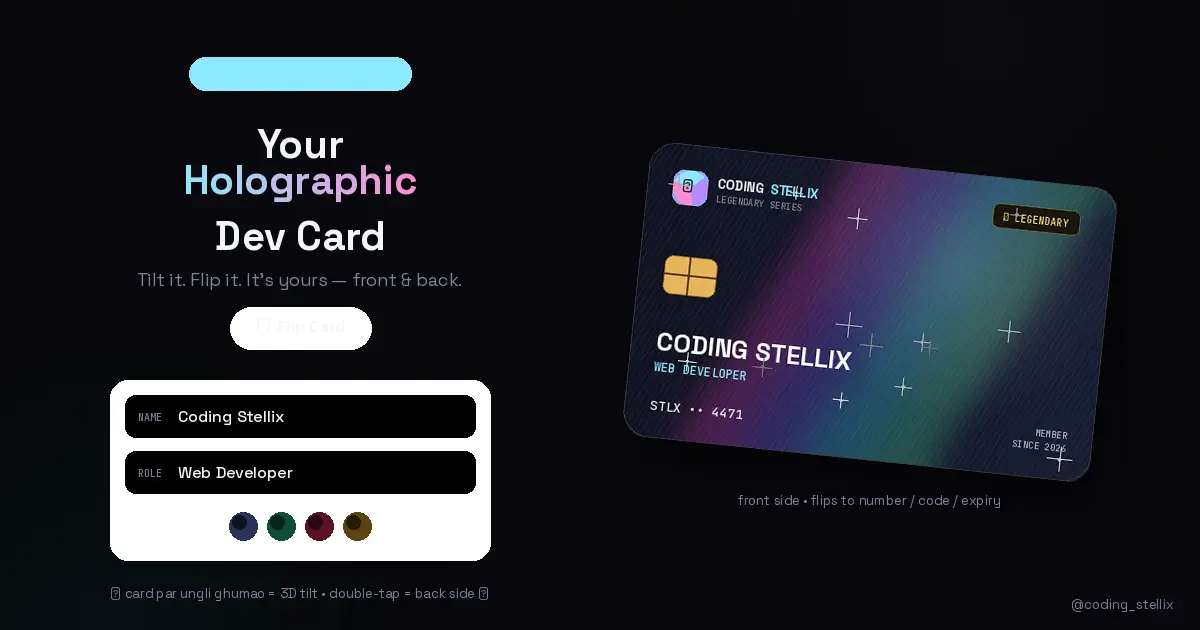
Do you remember the first time you held a rare holographic trading card? You’d tilt it under the light, watch the rainbow foil shift across the surface, and for a few seconds that little piece of cardboard felt like treasure.
I wanted that exact feeling — in a browser. For developers. With your own name on it.
So I built the Stellix Holo Card: a personalized, two-sided, 3D holographic developer card that lives in a single HTML file. Type your name, and you get your own Legendary-series card. Move your finger across it and it tilts in 3D while rainbow foil sweeps over the surface. Double-tap it, and it flips over to reveal a full card number, a security code, and an expiry date — all generated uniquely from your name.
No frameworks. No 3D libraries. No images. Just HTML, CSS, and vanilla JavaScript doing things most people assume need WebGL.
What’s actually on the card
The front looks like a premium bank card crossed with a collectible. There’s a glowing gem logo, a “★ LEGENDARY” rarity tag in gold, a realistic EMV chip drawn entirely in CSS, your name in bold caps, your role underneath it, and a short member number at the bottom with “MEMBER SINCE 2026.”
Flip it over and the back gets serious: a black magnetic stripe across the top, a signature strip with your name written in a handwriting-style font, a white code box holding a three-digit number, a full sixteen-digit card number glowing in the center, and a VALID THRU date in the corner. There’s even a tiny animated hologram square that slowly cycles through colors, the way security holograms shimmer on real cards.
Here’s the part I’m most pleased with: every number on the card is generated from your name. I run the name through a small hashing function, and out come your card number, your code, and your expiry date. Change one letter of your name and the whole identity changes. Two people will practically never get the same card. It’s decorative, obviously — nobody’s buying coffee with this — but it makes each card feel genuinely yours.
The holographic effect, explained honestly
People keep asking if the foil is a video or an image. It’s neither. It’s four stacked CSS layers, each doing one job:
The foil layer is a diagonal linear gradient of pink, purple, cyan, and green, set to screen blend mode so it glows against the dark card. Its position is tied to your pointer through CSS variables — as your finger moves, JavaScript updates two numbers, and the rainbow slides across the surface.
The diffraction lines are a repeating one-pixel gradient laid over everything at low opacity. Real foil has microscopic ridges that catch light; this fakes that texture convincingly, and the line angle rotates slightly with the card’s tilt.
The glare is a radial white gradient that follows your touch like a light source reflecting off plastic.
And the sparkles are a small canvas layer floating above the card, drawing four-pointed stars that twinkle — and here’s the detail I love — they get brighter the more you tilt the card. Hold it flat and they’re shy. Tilt it hard and the whole surface glitters.
The 3D tilt itself is just CSS perspective and rotateX/rotateY, smoothed with a simple easing loop so the card feels like it has weight instead of snapping to your cursor. On phones, it goes one better: the gyroscope drives the tilt, so you physically rotate your phone in your hand and the card responds like a real object. Watching that work for the first time was the moment this project stopped feeling like a demo and started feeling like magic.
The flip was the hard part
Making a card flip sounds trivial until you try to combine it with live tilt. The rotation from your finger and the 180-degree flip both fight over the same transform property, so I ended up composing them every frame: the card’s final rotation is the tilt angle plus the current flip angle, with the flip eased toward its target so it swings over smoothly instead of teleporting.
Then a subtle bug appeared: after flipping, the glare highlight moved the wrong way — because the back face is mirrored, left becomes right. The fix was one line — mirror the glare’s X position whenever the flip passes ninety degrees — but finding it took an embarrassing amount of staring. That’s frontend development in one sentence: the fix is one line, the finding is one evening.
Both faces use backface-visibility: hidden, which is the old, reliable trick that makes two absolutely-positioned divs behave like the two sides of a physical object.
Why I keep building in one file
Every project I share follows the same rule: one HTML file, zero dependencies, open it anywhere. It’s partly stubbornness and partly teaching philosophy. When a beginner downloads this card, there’s no build step to fail, no node_modules folder to scare them, no framework docs to read first. They open one file, see everything — structure, style, logic — and can start breaking things immediately. Breaking things is how everyone I know actually learned to code.
And constraints breed creativity. Because I couldn’t reach for a 3D library, I had to really understand CSS transforms. Because I couldn’t use foil images, I had to learn how blend modes compose. The limitations are the curriculum.
Make it yours
There are four card themes — Midnight navy, Emerald, Crimson, and Gold — switchable with one tap, and the theme applies to both faces at once. The name and role fields update the card live as you type, signature included. Long names, short names, nicknames — the layout holds.
My favorite way people have used it so far: typing in a friend’s name, flipping the card, and sending them a screenshot with “your Legendary card has been issued.” It’s a small thing, but small things that carry someone’s name always land differently.
So here’s my ask: open it, put your name on it, tilt your phone, and watch your own foil shimmer. Then flip it over and check your card number — remember, no one else on earth gets that exact one. If you customize the design, change the rarity tag, or build your own series, tag me. I want to see what your card looks like.
Everything’s in the file. Take it apart. That’s what it’s for.
— Coding Stellix One file. Two sides. Infinitely yours.
<!DOCTYPE html>
<html lang="en">
<head>
<meta charset="UTF-8">
<meta name="viewport" content="width=device-width, initial-scale=1.0, viewport-fit=cover">
<title>Stellix Holo Card 💳 | Coding Stellix</title>
<link rel="preconnect" href="https://fonts.googleapis.com">
<link href="https://fonts.googleapis.com/css2?family=Space+Grotesk:wght@500;600;700&family=JetBrains+Mono:wght@400;600&display=swap" rel="stylesheet">
<style>
/* ============================================================
STELLIX HOLO CARD 💳 — 3D Holographic Dev Card (2-sided)
A Coding Stellix Project
FRONT: name, role, chip, holo foil.
BACK: magnetic stripe, full card number, expiry, CVV code.
Flip with the button or double-tap the card.
============================================================ */
:root{
--bg:#07070c;
--ink:#f2f4fa;
--dim:#7d84a0;
--border:rgba(255,255,255,.12);
--glass:rgba(255,255,255,.05);
--display:'Space Grotesk',sans-serif;
--mono:'JetBrains Mono',monospace;
}
*{margin:0;padding:0;box-sizing:border-box;-webkit-tap-highlight-color:transparent}
html,body{min-height:100%}
body{
background:
radial-gradient(700px 500px at 80% -10%, rgba(120,80,255,.16), transparent 60%),
radial-gradient(600px 460px at 5% 105%, rgba(0,220,255,.1), transparent 60%),
var(--bg);
color:var(--ink);
font-family:var(--display);
display:flex;flex-direction:column;align-items:center;
padding:clamp(1rem,3.5vw,2rem);
min-height:100vh;
overflow-x:hidden;
}
/* ---------- header ---------- */
header{text-align:center;margin-bottom:clamp(1rem,3vh,1.6rem)}
.kicker{
display:inline-block;font-size:.62rem;letter-spacing:.3em;text-transform:uppercase;
color:#8be9ff;border:1px solid rgba(139,233,255,.3);
padding:.35rem .95rem;border-radius:999px;margin-bottom:.7rem;
background:rgba(139,233,255,.06);
}
h1{font-weight:700;font-size:clamp(1.4rem,5.8vw,2.3rem);line-height:1.15}
h1 em{
font-style:normal;
background:linear-gradient(90deg,#8be9ff,#b48bff,#ff8bd6);
-webkit-background-clip:text;background-clip:text;color:transparent;
}
header p{color:var(--dim);margin-top:.4rem;font-size:clamp(.76rem,2.7vw,.9rem)}
/* ---------- card scene ---------- */
.scene{
perspective:1100px;
margin:clamp(.6rem,2vh,1.4rem) 0 clamp(.8rem,2.4vh,1.3rem);
touch-action:none;
}
.card{
position:relative;
width:min(88vw,380px);
aspect-ratio:1.586;
border-radius:20px;
transform-style:preserve-3d;
will-change:transform;
cursor:grab;
}
.card:active{cursor:grabbing}
.card-face{
position:absolute;inset:0;border-radius:20px;overflow:hidden;
backface-visibility:hidden;
-webkit-backface-visibility:hidden;
box-shadow:
0 30px 70px rgba(0,0,0,.6),
0 0 0 1px rgba(255,255,255,.1) inset;
background:linear-gradient(135deg,#101322 0%,#181d33 45%,#10182c 100%);
}
.card-face.back{ transform:rotateY(180deg); }
/* holo layers (both faces) */
.foil{
position:absolute;inset:0;
background:
linear-gradient(
calc(115deg + var(--rx,0) * 1.2deg),
transparent 20%,
rgba(255, 60, 200, .22) 34%,
rgba(120, 90, 255, .26) 44%,
rgba( 60,220,255, .26) 54%,
rgba( 90,255,170, .22) 64%,
transparent 80%
);
background-size:220% 220%;
background-position:calc(50% + var(--mx,0) * 1%) calc(50% + var(--my,0) * 1%);
mix-blend-mode:screen;
pointer-events:none;
}
.foil-lines{
position:absolute;inset:0;opacity:.16;mix-blend-mode:overlay;pointer-events:none;
background:repeating-linear-gradient(
calc(25deg + var(--rx,0) * .8deg),
rgba(255,255,255,.6) 0 1px, transparent 1px 5px
);
}
.glare{
position:absolute;inset:0;pointer-events:none;
background:radial-gradient(
420px 300px at calc(50% + var(--mx,0) * 1%) calc(50% + var(--my,0) * 1%),
rgba(255,255,255,.28), transparent 55%);
mix-blend-mode:screen;
}
.circuit{
position:absolute;inset:0;opacity:.1;pointer-events:none;
background-image:
linear-gradient(rgba(139,233,255,.7) 1px, transparent 1px),
linear-gradient(90deg, rgba(139,233,255,.7) 1px, transparent 1px);
background-size:26px 26px;
mask-image:radial-gradient(ellipse at 78% 24%, black 8%, transparent 55%);
-webkit-mask-image:radial-gradient(ellipse at 78% 24%, black 8%, transparent 55%);
}
/* ---------- FRONT content ---------- */
.content{
position:absolute;inset:0;
padding:clamp(.9rem,4.4vw,1.4rem);
display:flex;flex-direction:column;justify-content:space-between;
transform:translateZ(40px);
}
.row-top{display:flex;align-items:flex-start;justify-content:space-between}
.logo-badge{display:flex;align-items:center;gap:.45rem}
.logo-badge .gem{
width:30px;height:30px;border-radius:9px;
background:conic-gradient(from 200deg,#8be9ff,#b48bff,#ff8bd6,#8be9ff);
box-shadow:0 0 16px rgba(139,233,255,.5);
display:flex;align-items:center;justify-content:center;
font-size:.85rem;
}
.logo-badge b{font-size:clamp(.66rem,2.6vw,.8rem);letter-spacing:.1em}
.logo-badge b span{color:#8be9ff}
.rarity{
font-family:var(--mono);font-size:.56rem;letter-spacing:.22em;
color:#ffd76b;border:1px solid rgba(255,215,107,.4);
padding:.22rem .5rem;border-radius:6px;
background:rgba(255,215,107,.07);
text-transform:uppercase;
}
.chip{
width:clamp(34px,10vw,44px);height:clamp(26px,7.6vw,33px);border-radius:7px;
background:linear-gradient(135deg,#ffd76b,#c98f2c);
position:relative;overflow:hidden;
box-shadow:0 2px 6px rgba(0,0,0,.4);
}
.chip::before,.chip::after{content:'';position:absolute;background:rgba(0,0,0,.28)}
.chip::before{left:0;right:0;top:46%;height:2px}
.chip::after{top:0;bottom:0;left:46%;width:2px}
.holder{display:flex;flex-direction:column;gap:.15rem}
.holder .nm{
font-size:clamp(1.05rem,5vw,1.5rem);font-weight:700;letter-spacing:.06em;
text-transform:uppercase;text-shadow:0 2px 12px rgba(0,0,0,.6);
word-break:break-word;
}
.holder .rl{
font-family:var(--mono);font-size:clamp(.58rem,2.4vw,.7rem);
color:#8be9ff;letter-spacing:.16em;text-transform:uppercase;
}
.row-bottom{
display:flex;align-items:flex-end;justify-content:space-between;
font-family:var(--mono);
}
.front-num{font-size:clamp(.6rem,2.6vw,.76rem);letter-spacing:.24em;color:rgba(255,255,255,.75)}
.since{font-size:.54rem;color:var(--dim);letter-spacing:.14em;text-align:right;line-height:1.6}
.since b{color:var(--ink)}
/* ---------- BACK content ---------- */
.back-content{
position:absolute;inset:0;
display:flex;flex-direction:column;
transform:translateZ(40px);
font-family:var(--mono);
}
.magstripe{
height:clamp(30px,9vw,42px);
background:linear-gradient(180deg,#0b0b0f,#1a1a22 50%,#0b0b0f);
margin-top:clamp(.8rem,3.6vw,1.2rem);
box-shadow:0 2px 8px rgba(0,0,0,.5) inset;
}
.back-body{
flex:1;padding:clamp(.6rem,3vw,1rem) clamp(.9rem,4.4vw,1.4rem);
display:flex;flex-direction:column;justify-content:space-between;
}
.sig-row{display:flex;align-items:stretch;gap:.6rem}
.sig-strip{
flex:1;height:clamp(24px,7vw,32px);border-radius:5px;
background:repeating-linear-gradient(0deg,#e8e8ea 0 3px,#d5d5da 3px 6px);
display:flex;align-items:center;padding:0 .7rem;
overflow:hidden;
}
.sig-strip i{
font-style:italic;color:#2a2a34;
font-size:clamp(.66rem,2.8vw,.82rem);
font-family:'Segoe Script','Comic Sans MS',cursive;
white-space:nowrap;
}
.cvv-box{
display:flex;flex-direction:column;align-items:center;justify-content:center;gap:.1rem;
background:#fff;border-radius:5px;
padding:.2rem .6rem;min-width:54px;
}
.cvv-box .lb{font-size:.44rem;color:#666;letter-spacing:.14em}
.cvv-box .vl{font-size:clamp(.7rem,3vw,.85rem);font-weight:600;color:#111}
.num-block{text-align:center}
.full-num{
font-size:clamp(.92rem,4.6vw,1.25rem);letter-spacing:.14em;font-weight:600;
color:#fff;text-shadow:0 0 14px rgba(139,233,255,.45);
word-spacing:.4em;
}
.num-caption{
margin-top:.2rem;font-size:.5rem;color:var(--dim);letter-spacing:.24em;text-transform:uppercase;
}
.back-foot{display:flex;align-items:flex-end;justify-content:space-between}
.expiry .lb{font-size:.48rem;color:var(--dim);letter-spacing:.18em}
.expiry .vl{font-size:clamp(.78rem,3.4vw,.95rem);font-weight:600;letter-spacing:.1em;margin-top:.1rem}
.holo-sq{
width:clamp(30px,8.6vw,40px);height:clamp(30px,8.6vw,40px);border-radius:8px;
background:conic-gradient(from 0deg,#8be9ff,#b48bff,#ff8bd6,#8bffc9,#8be9ff);
opacity:.85;box-shadow:0 0 14px rgba(139,233,255,.5);
animation:holoSpin 6s linear infinite;
}
@keyframes holoSpin{to{filter:hue-rotate(360deg)}}
.back-brand{font-size:.5rem;color:var(--dim);letter-spacing:.2em;text-transform:uppercase}
.back-brand b{color:#8be9ff}
canvas.sparkles{
position:absolute;inset:0;border-radius:20px;pointer-events:none;
transform:translateZ(60px);
}
/* ---------- flip button ---------- */
.flip-btn{
margin-bottom:clamp(.8rem,2.4vh,1.2rem);
font-family:var(--display);font-weight:600;font-size:.82rem;
color:var(--ink);background:var(--glass);
border:1px solid var(--border);border-radius:999px;
padding:.6rem 1.6rem;cursor:pointer;
backdrop-filter:blur(12px);-webkit-backdrop-filter:blur(12px);
transition:border-color .2s,transform .2s;
}
.flip-btn:hover{border-color:#8be9ff;transform:translateY(-2px)}
.flip-btn:focus-visible{outline:2px solid #8be9ff;outline-offset:3px}
/* ---------- controls ---------- */
.controls{
width:min(94vw,420px);
background:var(--glass);border:1px solid var(--border);
border-radius:18px;padding:14px;
backdrop-filter:blur(16px);-webkit-backdrop-filter:blur(16px);
display:flex;flex-direction:column;gap:.6rem;
}
.field{
display:flex;align-items:center;gap:.55rem;
background:rgba(0,0,0,.3);border:1px solid var(--border);
border-radius:12px;padding:0 .85rem;height:46px;
}
.field label{
font-family:var(--mono);font-size:.6rem;color:var(--dim);letter-spacing:.12em;
flex:none;text-transform:uppercase;
}
.field input{
flex:1;min-width:0;background:transparent;border:none;outline:none;
color:var(--ink);font-family:var(--display);font-weight:600;
font-size:clamp(.82rem,3.2vw,.95rem);
}
.themes{display:flex;gap:.5rem;justify-content:center;padding-top:.15rem}
.th{
width:28px;height:28px;border-radius:50%;cursor:pointer;
border:2px solid transparent;transition:transform .16s,border-color .16s;
}
.th:hover{transform:scale(1.15)}
.th.sel{border-color:#fff}
.th:focus-visible{outline:2px solid #fff;outline-offset:2px}
.hint{
margin-top:.9rem;font-size:clamp(.62rem,2.4vw,.72rem);color:var(--dim);
letter-spacing:.06em;text-align:center;
}
.hint b{color:var(--ink)}
footer{
margin-top:auto;padding-top:1.2rem;
font-size:.66rem;color:var(--dim);letter-spacing:.08em;text-align:center;
}
footer b{
background:linear-gradient(90deg,#8be9ff,#ff8bd6);
-webkit-background-clip:text;background-clip:text;color:transparent;
}
@media (prefers-reduced-motion:reduce){
*{animation-duration:.01ms!important;transition-duration:.01ms!important}
}
</style>
</head>
<body>
<header>
<span class="kicker">Coding Stellix Originals</span>
<h1>Your <em>Holographic</em> Dev Card</h1>
<p>Tilt it. Flip it. It's yours — front & back.</p>
</header>
<div class="scene" id="scene">
<div class="card" id="card">
<!-- ============ FRONT ============ -->
<div class="card-face front" id="faceFront">
<div class="circuit"></div>
<div class="foil"></div>
<div class="foil-lines"></div>
<div class="glare"></div>
<div class="content">
<div class="row-top">
<div class="logo-badge">
<div class="gem">✦</div>
<b>CODING <span>STELLIX</span></b>
</div>
<span class="rarity">★ Legendary</span>
</div>
<div class="chip"></div>
<div class="holder">
<div class="nm" id="cardName">CODING STELLIX</div>
<div class="rl" id="cardRole">Web Developer</div>
</div>
<div class="row-bottom">
<span class="front-num" id="frontNum">STLX •• 0001</span>
<span class="since">MEMBER<br><b>SINCE 2026</b></span>
</div>
</div>
<canvas class="sparkles" id="sparklesF"></canvas>
</div>
<!-- ============ BACK ============ -->
<div class="card-face back" id="faceBack">
<div class="foil"></div>
<div class="foil-lines"></div>
<div class="glare"></div>
<div class="back-content">
<div class="magstripe"></div>
<div class="back-body">
<div class="sig-row">
<div class="sig-strip"><i id="sigName">CODING STELLIX</i></div>
<div class="cvv-box">
<span class="lb">CODE</span>
<span class="vl" id="cvv">•••</span>
</div>
</div>
<div class="num-block">
<div class="full-num" id="fullNum">5312 8842 2026 0001</div>
<div class="num-caption">Stellix Developer Number</div>
</div>
<div class="back-foot">
<div class="expiry">
<div class="lb">VALID THRU</div>
<div class="vl" id="expiry">12 / 30</div>
</div>
<span class="back-brand"><b>Coding</b> Stellix • Legendary Series</span>
<div class="holo-sq"></div>
</div>
</div>
</div>
<canvas class="sparkles" id="sparklesB"></canvas>
</div>
</div>
</div>
<button class="flip-btn" id="flipBtn">↻ Flip Card</button>
<div class="controls">
<div class="field">
<label>Name</label>
<input id="inName" type="text" maxlength="20" value="CODING STELLIX" autocomplete="off" spellcheck="false">
</div>
<div class="field">
<label>Role</label>
<input id="inRole" type="text" maxlength="26" value="Web Developer" autocomplete="off" spellcheck="false">
</div>
<div class="themes" id="themes">
<button class="th sel" data-t="midnight" style="background:linear-gradient(135deg,#101322,#2a3358)" aria-label="Midnight theme"></button>
<button class="th" data-t="emerald" style="background:linear-gradient(135deg,#07231a,#0e4d38)" aria-label="Emerald theme"></button>
<button class="th" data-t="crimson" style="background:linear-gradient(135deg,#26070f,#5c1226)" aria-label="Crimson theme"></button>
<button class="th" data-t="gold" style="background:linear-gradient(135deg,#241a05,#5c4310)" aria-label="Gold theme"></button>
</div>
</div>
<p class="hint">✦ card par ungli ghumao = 3D tilt • <b>double-tap</b> ya Flip button = back side ✦</p>
<footer>Forged with 💳 by <b>Coding Stellix</b> — collect yourself</footer>
<script>
/* =====================================================
STELLIX HOLO CARD (2-sided) — engine
A Coding Stellix Project
Note: the number, code and expiry are decorative and
generated from the name hash — not a real payment card.
===================================================== */
const card = document.getElementById('card');
const faceFront = document.getElementById('faceFront');
const faceBack = document.getElementById('faceBack');
const scene = document.getElementById('scene');
const flipBtn = document.getElementById('flipBtn');
/* ---------- flip state ---------- */
let flipped = false;
let flipAngle = 0, targetFlip = 0;
function setFlip(v){
flipped = v;
targetFlip = flipped ? 180 : 0;
flipBtn.textContent = flipped ? '↻ Show Front' : '↻ Flip Card';
}
flipBtn.addEventListener('click', () => setFlip(!flipped));
card.addEventListener('dblclick', () => setFlip(!flipped));
/* double-tap for touch */
let lastTap = 0;
card.addEventListener('pointerup', e => {
if (e.pointerType !== 'touch') return;
const now = Date.now();
if (now - lastTap < 320) setFlip(!flipped);
lastTap = now;
});
/* ---------- 3D tilt (pointer) ---------- */
let targetRX = 0, targetRY = 0, curRX = 0, curRY = 0;
let glareX = 0, glareY = 0;
function pointerTilt(e){
const r = card.getBoundingClientRect();
const px = (e.clientX - r.left) / r.width;
const py = (e.clientY - r.top) / r.height;
targetRY = (px - .5) * 26;
targetRX = (py - .5) * -22;
glareX = (px - .5) * 100;
glareY = (py - .5) * 100;
}
scene.addEventListener('pointermove', pointerTilt);
scene.addEventListener('pointerdown', pointerTilt);
scene.addEventListener('pointerleave', () => { targetRX = 0; targetRY = 0; });
/* ---------- gyroscope tilt (mobile) ---------- */
let gyroOn = false;
function enableGyro(){
if (gyroOn) return;
const handler = ev => {
if (ev.beta == null) return;
gyroOn = true;
targetRX = Math.max(-22, Math.min(22, (ev.beta - 40) * -.6));
targetRY = Math.max(-26, Math.min(26, ev.gamma * .8));
glareX = targetRY * 3.2;
glareY = -targetRX * 3.6;
};
if (typeof DeviceOrientationEvent !== 'undefined' &&
typeof DeviceOrientationEvent.requestPermission === 'function'){
document.body.addEventListener('click', () => {
DeviceOrientationEvent.requestPermission()
.then(s => { if (s === 'granted') addEventListener('deviceorientation', handler); })
.catch(() => {});
}, { once: true });
} else {
addEventListener('deviceorientation', handler);
}
}
enableGyro();
/* smooth tilt + flip composition */
function tiltLoop(){
curRX += (targetRX - curRX) * .12;
curRY += (targetRY - curRY) * .12;
flipAngle += (targetFlip - flipAngle) * .14;
card.style.transform = `rotateX(${curRX}deg) rotateY(${curRY + flipAngle}deg)`;
// when flipped, mirror the glare X so it still follows the finger naturally
const backSide = flipAngle > 90;
const gx = backSide ? -glareX : glareX;
[faceFront, faceBack].forEach(f => {
f.style.setProperty('--mx', gx.toFixed(1));
f.style.setProperty('--my', glareY.toFixed(1));
f.style.setProperty('--rx', curRY.toFixed(1));
});
requestAnimationFrame(tiltLoop);
}
tiltLoop();
/* ---------- identity: name → number, code, expiry ---------- */
const inName = document.getElementById('inName');
const inRole = document.getElementById('inRole');
const cardName = document.getElementById('cardName');
const cardRole = document.getElementById('cardRole');
const frontNum = document.getElementById('frontNum');
const fullNum = document.getElementById('fullNum');
const cvvEl = document.getElementById('cvv');
const expiryEl = document.getElementById('expiry');
const sigName = document.getElementById('sigName');
function hash(str, mod, seed){
let h = seed;
for (const c of str) h = (h * 31 + c.charCodeAt(0)) % 999983;
return h % mod;
}
function pad(n, len){ return String(n).padStart(len, '0'); }
function syncCard(){
const raw = inName.value.trim() || 'Your Name';
const n = raw.toUpperCase();
cardName.textContent = n;
cardRole.textContent = (inRole.value.trim() || 'Developer');
sigName.textContent = raw;
const g1 = pad(4000 + hash(raw, 6000, 7), 4);
const g2 = pad(hash(raw, 10000, 13), 4);
const g4 = pad(hash(raw, 10000, 31), 4);
fullNum.textContent = `${g1} ${g2} 2026 ${g4}`;
frontNum.textContent = `STLX •• ${g4}`;
cvvEl.textContent = pad(hash(raw, 900, 53) + 100, 3);
const mm = pad(hash(raw, 12, 71) + 1, 2);
const yy = 28 + hash(raw, 6, 97); // 28–33
expiryEl.textContent = `${mm} / ${yy}`;
}
inName.addEventListener('input', syncCard);
inRole.addEventListener('input', syncCard);
syncCard();
/* ---------- themes (both faces) ---------- */
const THEMES = {
midnight:'linear-gradient(135deg,#101322 0%,#181d33 45%,#10182c 100%)',
emerald :'linear-gradient(135deg,#07231a 0%,#0e4d38 50%,#062018 100%)',
crimson :'linear-gradient(135deg,#26070f 0%,#5c1226 50%,#1e050c 100%)',
gold :'linear-gradient(135deg,#241a05 0%,#5c4310 50%,#1e1504 100%)',
};
document.getElementById('themes').addEventListener('click', e => {
const b = e.target.closest('.th');
if (!b) return;
document.querySelectorAll('.th').forEach(x => x.classList.remove('sel'));
b.classList.add('sel');
faceFront.style.background = THEMES[b.dataset.t];
faceBack.style.background = THEMES[b.dataset.t];
});
/* ---------- sparkles (front + back canvases) ---------- */
function makeSparkles(canvas){
const sc = canvas.getContext('2d');
let SW, SH, DPR;
function size(){
DPR = Math.min(devicePixelRatio || 1, 2);
const r = canvas.getBoundingClientRect();
SW = canvas.width = Math.max(1, r.width * DPR);
SH = canvas.height = Math.max(1, r.height * DPR);
}
size();
addEventListener('resize', size);
const sparks = Array.from({ length: 24 }, () => ({
x: Math.random(), y: Math.random(),
tw: Math.random() * Math.PI * 2,
sp: .02 + Math.random() * .05,
sizeR: .8 + Math.random() * 1.6,
}));
function loop(){
sc.clearRect(0, 0, SW, SH);
const tiltBoost = Math.min(1, (Math.abs(curRX) + Math.abs(curRY)) / 20);
for (const s of sparks){
s.tw += s.sp;
const a = Math.max(0, Math.sin(s.tw)) * (.35 + tiltBoost * .65);
if (a < .04) continue;
const x = s.x * SW, y = s.y * SH, r = s.sizeR * DPR * (1 + tiltBoost);
sc.globalAlpha = a;
sc.fillStyle = '#ffffff';
sc.beginPath();
sc.moveTo(x, y - r * 3);
sc.quadraticCurveTo(x, y, x + r * 3, y);
sc.quadraticCurveTo(x, y, x, y + r * 3);
sc.quadraticCurveTo(x, y, x - r * 3, y);
sc.quadraticCurveTo(x, y, x, y - r * 3);
sc.fill();
}
sc.globalAlpha = 1;
requestAnimationFrame(loop);
}
loop();
}
makeSparkles(document.getElementById('sparklesF'));
makeSparkles(document.getElementById('sparklesB'));
</script>
</body>
</html>