
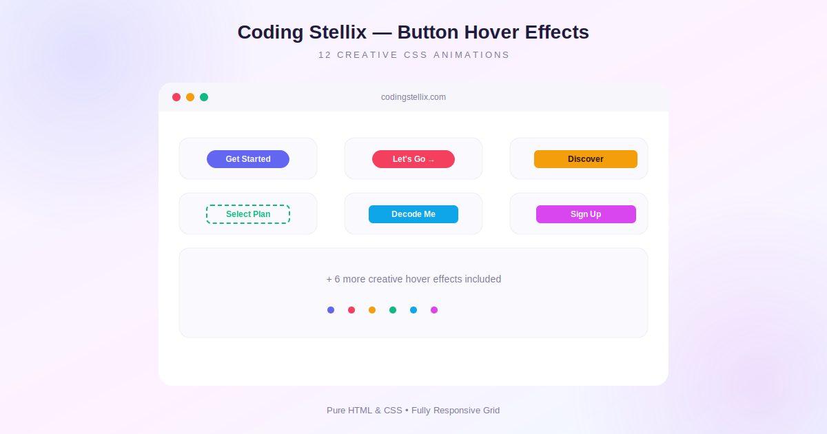
Buttons are probably the single most interacted-with element on any website, yet they are often the last thing anyone spends real design time on. A default button click just happens, with no feedback beyond a slight color change. Adding a well-crafted hover effect changes that completely, turning a plain rectangle into something that feels responsive and intentional the moment a visitor moves their mouse toward it. This article walks through how a whole library of these effects was built for a recent Coding Stellix project, covering the techniques behind several very different animation styles, all using nothing more than HTML and CSS, with a small touch of JavaScript for a couple of interactive extras.
Starting With a Reusable Base
Before building any individual effect, it helps to set up a consistent foundation that every button can share. Each button in this collection resets the usual browser defaults, removes the default outline and border, and sets position to relative, which turns out to be essential since almost every effect relies on pseudo-elements or absolutely positioned children layered on top of or behind the visible button text. Keeping this base consistent across every variation means each individual effect only needs to add the styles specific to itself, rather than repeating boilerplate over and over.
Simple Transform-Based Effects
The easiest category of hover effects relies entirely on the CSS transform property, since transforms are cheap for the browser to animate smoothly and never trigger a layout reflow. A squeeze and stretch effect, for example, just scales the button unevenly on its horizontal and vertical axes at the same time, using a bouncy cubic-bezier timing function so the motion feels elastic rather than mechanical. A skewed slide effect works the same way, applying a slight skew transform combined with a small scale increase, which gives the impression of the button leaning forward toward the cursor.
These transform-only effects are a great starting point for anyone new to CSS animation, since they involve almost no extra markup and can usually be added to an existing button with just a couple of lines.
Building a Liquid Morph Effect
One of the more visually interesting effects in this collection is a liquid, organic morph, achieved entirely through animating the border-radius property. Most people only ever set a single border-radius value, but the property actually accepts eight separate values that control each corner independently along both axes. By defining two very different sets of these values, one for the resting state and one for the hover state, and letting CSS transition smoothly between them, a plain rounded rectangle appears to melt into an irregular blob shape the moment the cursor arrives, then melt back when it leaves.
Working With Pseudo-Elements for Fill and Wipe Effects
A large number of hover effects in this collection depend on the ::before pseudo-element, positioned absolutely to cover the entire button and placed behind the text using a negative z-index. A circle expand fill effect starts this pseudo-element as a zero-size circle centered on the button, then transitions its width and height to a large value on hover, which visually reads as a wave of color rushing outward from the center. A diagonal wipe effect uses a similar idea but relies on the clip-path property instead of width and height, animating a polygon shape from a single point into a full rectangle to create a sharp angled reveal rather than a circular one.
Text-Based Effects
Several of the more playful effects in the collection actually animate the text itself rather than the button’s background. A typewriter reveal effect keeps a hidden version of the final text with a max-width of zero and overflow hidden, then transitions that max-width open on hover using a stepped timing function, which combined with a blinking cursor border creates a convincing typing animation. A text scramble effect goes a step further, using a small JavaScript interval that repeatedly swaps each character for a random symbol before gradually locking each letter into place from left to right, which reads almost like a decoding animation from a spy movie.
Adding Depth With 3D Transforms
CSS supports genuine three-dimensional transforms directly, and a couple of effects in this collection take advantage of that. A card flip effect wraps two faces, a front and a back, inside a container with transform-style set to preserve-3d, then rotates the whole thing 180 degrees around the X axis on hover. Each face uses backface-visibility hidden, which is what prevents both faces from being visible at once mid-rotation. A vertical roll effect achieves a similar swap using a simpler technique, stacking two lines of text inside an overflow-hidden container and simply translating the whole stack upward on hover, so the second line slides into view from below.
A Rotating Progress Ring Border
One of the more technically interesting effects uses a conic gradient, which is a gradient that sweeps around a center point like a clock face rather than moving in a straight line or radiating outward. By drawing a conic gradient on a slightly larger wrapping element behind the button and using a CSS mask to cut out everything except a thin ring around the edge, it becomes possible to build a border that fills itself in like a progress indicator, sweeping a full circle on hover using nothing but a CSS transition on the underlying gradient angle.
Keeping It Lightweight and Reusable
Every effect in this collection was deliberately built to be dropped into an existing project with minimal changes, since each one only needs its own small block of CSS and, for a couple of them, a tiny JavaScript snippet tied to a specific button ID. None of them depend on external animation libraries, which keeps page weight low and avoids adding any new dependencies to a project that might already be using its own framework or build tooling.
Final Thoughts
Building out a whole library of button hover effects turns out to be one of the more enjoyable ways to deepen an understanding of core CSS features like pseudo-elements, clip-path, conic gradients, and 3D transforms, all applied to something as small and familiar as a button. None of these techniques are exotic on their own, but combining them across a dozen different variations shows just how much visual variety is possible without ever reaching for JavaScript animation frameworks.
This is exactly the kind of practical, reusable component work Coding Stellix enjoys building and sharing, since every effect here can be lifted directly into another project and restyled with different colors in just a few minutes.
<!DOCTYPE html>
<html lang="en">
<head>
<meta charset="UTF-8">
<meta name="viewport" content="width=device-width, initial-scale=1.0">
<title>Button Hover Effects Vol. 3 | Coding Stellix</title>
<link rel="preconnect" href="https://fonts.googleapis.com">
<link href="https://fonts.googleapis.com/css2?family=Outfit:wght@500;600;700;800&display=swap" rel="stylesheet">
<style>
  :root{
    --bg: #f7f7fb;
    --bg2: #ffffff;
    --card: #ffffff;
    --border: rgba(31,27,58,0.08);
    --text: #1f1b3a;
    --muted: #7b7695;

    --indigo: #6366f1;
    --rose: #f43f5e;
    --amber: #f59e0b;
    --emerald: #10b981;
    --sky: #0ea5e9;
    --fuchsia: #d946ef;
  }

  *{ margin:0; padding:0; box-sizing:border-box; }

  html, body{
    background:
      radial-gradient(circle at 15% 0%, rgba(99,102,241,0.07), transparent 45%),
      radial-gradient(circle at 90% 90%, rgba(217,70,239,0.06), transparent 45%),
      var(--bg);
    color: var(--text);
    font-family: 'Outfit', sans-serif;
    min-height:100%;
  }

  #page{
    max-width: 1080px;
    margin: 0 auto;
    padding: 60px 24px 80px;
  }

  header{ text-align:center; margin-bottom: 54px; }
  header .eyebrow{
    font-size: 12px;
    letter-spacing: 3px;
    text-transform:uppercase;
    color: var(--muted);
    margin-bottom: 12px;
    font-weight:700;
  }
  header h1{
    font-size: clamp(28px, 5vw, 42px);
    font-weight:800;
    margin-bottom: 12px;
  }
  header h1 span{
    background: linear-gradient(90deg, var(--indigo), var(--fuchsia));
    -webkit-background-clip: text;
    background-clip: text;
    color: transparent;
  }
  header p{
    color: var(--muted);
    font-size: 15px;
    max-width: 540px;
    margin: 0 auto;
  }

  #grid{
    display:grid;
    grid-template-columns: repeat(auto-fit, minmax(260px, 1fr));
    gap: 20px;
  }

  .card{
    background: var(--card);
    border: 1px solid var(--border);
    border-radius: 18px;
    padding: 32px 22px;
    display:flex;
    flex-direction:column;
    align-items:center;
    gap: 20px;
    text-align:center;
    box-shadow: 0 10px 30px rgba(31,27,58,0.05);
    position:relative;
    overflow:hidden;
  }
  .card .label{
    font-size: 11px;
    letter-spacing: 1.5px;
    text-transform:uppercase;
    color: var(--muted);
    font-weight:700;
  }

  .hover-btn{
    font-family:'Outfit', sans-serif;
    font-size: 15px;
    font-weight:700;
    cursor:pointer;
    border: none;
    outline:none;
    position:relative;
    -webkit-tap-highlight-color: transparent;
  }

  /* 1. Liquid Morph Shape */
  .btn-liquid{
    padding: 15px 34px;
    background: var(--indigo);
    color: #fff;
    border-radius: 30px;
    transition: border-radius 0.5s ease, transform 0.3s ease;
  }
  .btn-liquid:hover{
    border-radius: 45% 55% 60% 40% / 50% 40% 60% 50%;
    transform: scale(1.05);
  }

  /* 2. Typewriter Reveal */
  .btn-type{
    padding: 15px 34px;
    background: #12141f;
    color: #fff;
    border-radius: 10px;
    overflow:hidden;
  }
  .btn-type .type-text{
    display:inline-block;
    white-space:nowrap;
    overflow:hidden;
    max-width: 0;
    vertical-align: bottom;
    border-right: 2px solid transparent;
    transition: max-width 0.5s steps(12, end);
  }
  .btn-type:hover .type-text{
    max-width: 200px;
    border-right-color: var(--emerald);
  }
  .btn-type .type-base{ opacity:1; transition: opacity 0.2s; }
  .btn-type:hover .type-base{ opacity:0; position:absolute; }

  /* 3. Card Flip 3D */
  .btn-flip-wrap{ perspective: 500px; display:inline-block; }
  .btn-flip{
    position:relative;
    width: 150px;
    height: 46px;
    transform-style: preserve-3d;
    transition: transform 0.5s ease;
  }
  .btn-flip-wrap:hover .btn-flip{ transform: rotateX(180deg); }
  .flip-face{
    position:absolute;
    inset:0;
    display:flex;
    align-items:center;
    justify-content:center;
    border-radius: 10px;
    backface-visibility: hidden;
    font-weight:700;
    font-family:'Outfit',sans-serif;
    font-size:15px;
  }
  .flip-front{ background: var(--rose); color:#fff; }
  .flip-back{ background: #1f1b3a; color: var(--rose); transform: rotateX(180deg); }

  /* 4. Circle Expand Fill */
  .btn-circle-fill{
    padding: 15px 34px;
    border-radius: 10px;
    background: transparent;
    color: var(--amber);
    border: 2px solid var(--amber);
    overflow:hidden;
    z-index:1;
  }
  .btn-circle-fill::before{
    content:'';
    position:absolute;
    left:50%; top:50%;
    width:0; height:0;
    background: var(--amber);
    border-radius:50%;
    transform: translate(-50%,-50%);
    transition: width 0.4s ease, height 0.4s ease;
    z-index:-1;
  }
  .btn-circle-fill:hover::before{ width:300px; height:300px; }
  .btn-circle-fill:hover{ color:#241300; }

  /* 5. Marching Ants Border */
  .btn-ants{
    padding: 15px 34px;
    border-radius: 10px;
    background: #fff;
    color: var(--emerald);
    border: 2px dashed rgba(16,185,129,0.4);
    transition: color 0.2s ease, border-color 0.2s ease;
  }
  .btn-ants:hover{
    border-color: var(--emerald);
    animation: antsMove 0.6s linear infinite;
  }
  @keyframes antsMove{
    to{ border-style: dashed; background-position: 20px 0; }
  }
  .btn-ants:hover{
    background-image: repeating-linear-gradient(90deg, var(--emerald) 0 8px, transparent 8px 16px);
    background-size: 16px 2px;
    background-repeat: repeat-x;
    background-position: 0 0;
    border: 2px solid transparent;
    animation: antsSlide 0.5s linear infinite;
    box-shadow: inset 0 0 0 2px rgba(16,185,129,0.15);
  }
  @keyframes antsSlide{ to{ background-position: 16px 0; } }

  /* 6. Text Scramble */
  .btn-scramble{
    padding: 15px 34px;
    border-radius: 10px;
    background: var(--sky);
    color: #fff;
  }

  /* 7. Vertical Roll Flip */
  .btn-roll{
    padding: 15px 34px;
    border-radius: 10px;
    background: var(--fuchsia);
    color:#fff;
    overflow:hidden;
    display:flex;
    flex-direction:column;
    height: 46px;
  }
  .btn-roll .roll-inner{
    transition: transform 0.35s ease;
  }
  .btn-roll:hover .roll-inner{ transform: translateY(-100%); }
  .roll-line{
    height: 46px;
    display:flex;
    align-items:center;
    justify-content:center;
  }

  /* 8. Progress Ring Border */
  .btn-ring-wrap{ position:relative; display:inline-block; }
  .btn-ring{
    padding: 15px 34px;
    border-radius: 10px;
    background: #1f1b3a;
    color:#fff;
    position:relative;
    z-index:1;
  }
  .btn-ring-wrap::before{
    content:'';
    position:absolute;
    inset:-3px;
    border-radius: 13px;
    padding: 3px;
    background: conic-gradient(var(--indigo) 0deg, transparent 0deg);
    -webkit-mask: linear-gradient(#fff 0 0) content-box, linear-gradient(#fff 0 0);
    -webkit-mask-composite: xor;
    mask-composite: exclude;
    transition: background 0.6s ease;
  }
  .btn-ring-wrap:hover::before{ background: conic-gradient(var(--indigo) 360deg, transparent 360deg); }

  /* 9. Squeeze Stretch */
  .btn-squeeze{
    padding: 15px 34px;
    border-radius: 30px;
    background: var(--rose);
    color:#fff;
    transition: transform 0.3s cubic-bezier(.68,-0.4,.27,1.4);
  }
  .btn-squeeze:hover{ transform: scaleX(1.15) scaleY(0.9); }

  /* 10. Icon Morph */
  .btn-icon-morph{
    padding: 15px 30px;
    border-radius: 10px;
    background: #12141f;
    color:#fff;
    display:flex;
    align-items:center;
    gap:10px;
  }
  .icon-morph{
    width:16px; height:16px;
    position:relative;
  }
  .icon-morph .arrow-i, .icon-morph .check-i{
    position:absolute;
    inset:0;
    transition: opacity 0.25s ease, transform 0.25s ease;
  }
  .icon-morph .check-i{ opacity:0; transform: scale(0.5) rotate(-90deg); }
  .btn-icon-morph:hover .arrow-i{ opacity:0; transform: scale(0.5) rotate(90deg); }
  .btn-icon-morph:hover .check-i{ opacity:1; transform: scale(1) rotate(0deg); color: var(--emerald); }

  /* 11. Diagonal Wipe */
  .btn-wipe{
    padding: 15px 34px;
    border-radius: 10px;
    background: transparent;
    color: var(--indigo);
    border: 2px solid var(--indigo);
    z-index:1;
    overflow:hidden;
  }
  .btn-wipe::before{
    content:'';
    position:absolute;
    inset:0;
    background: var(--indigo);
    clip-path: polygon(0 100%, 0 100%, 0 100%);
    transition: clip-path 0.35s ease;
    z-index:-1;
  }
  .btn-wipe:hover::before{ clip-path: polygon(0 0, 100% 0, 100% 100%, 0 100%); }
  .btn-wipe:hover{ color:#fff; }

  /* 12. Letter Spacing Expand */
  .btn-tracking{
    padding: 15px 34px;
    border-radius: 10px;
    background: #1f1b3a;
    color: var(--amber);
    letter-spacing: 1px;
    transition: letter-spacing 0.3s ease, color 0.3s ease;
  }
  .btn-tracking:hover{ letter-spacing: 4px; color: #fff; }

  footer{
    text-align:center;
    margin-top: 60px;
    font-size: 12px;
    letter-spacing: 1.5px;
    text-transform: uppercase;
    color: var(--muted);
    font-weight:700;
  }
  footer span{ color: var(--indigo); }

  @media (max-width: 480px){
    #page{ padding: 40px 16px 60px; }
    .card{ padding: 26px 16px; }
  }
</style>
</head>
<body>

<div id="page">
  <header>
    <div class="eyebrow">Coding Stellix — UI Components Vol. 3</div>
    <h1>Fresh <span>Hover Effects</span></h1>
    <p>A third completely new set of 12 button hover animations — liquid morphs, 3D flips, text scramble, progress rings and more — in a clean, light glass design.</p>
  </header>

  <div id="grid">

    <div class="card">
      <div class="label">Liquid Morph</div>
      <button class="hover-btn btn-liquid">Get Started</button>
    </div>

    <div class="card">
      <div class="label">Typewriter Reveal</div>
      <button class="hover-btn btn-type">
        <span class="type-base">Hover Me</span>
        <span class="type-text">Welcome Aboard!</span>
      </button>
    </div>

    <div class="card">
      <div class="label">Card Flip 3D</div>
      <div class="btn-flip-wrap">
        <div class="btn-flip">
          <div class="flip-face flip-front">View More</div>
          <div class="flip-face flip-back">Let's Go →</div>
        </div>
      </div>
    </div>

    <div class="card">
      <div class="label">Circle Expand Fill</div>
      <button class="hover-btn btn-circle-fill">Discover</button>
    </div>

    <div class="card">
      <div class="label">Marching Ants Border</div>
      <button class="hover-btn btn-ants">Select Plan</button>
    </div>

    <div class="card">
      <div class="label">Text Scramble</div>
      <button class="hover-btn btn-scramble" id="scrambleBtn" data-text="Decode Me">Decode Me</button>
    </div>

    <div class="card">
      <div class="label">Vertical Roll</div>
      <button class="hover-btn btn-roll">
        <span class="roll-inner">
          <span class="roll-line">Sign Up</span>
          <span class="roll-line">Let's Roll</span>
        </span>
      </button>
    </div>

    <div class="card">
      <div class="label">Progress Ring Border</div>
      <div class="btn-ring-wrap">
        <button class="hover-btn btn-ring">Load More</button>
      </div>
    </div>

    <div class="card">
      <div class="label">Squeeze Stretch</div>
      <button class="hover-btn btn-squeeze">Tap Here</button>
    </div>

    <div class="card">
      <div class="label">Icon Morph</div>
      <button class="hover-btn btn-icon-morph">
        Confirm
        <span class="icon-morph">
          <svg class="arrow-i" viewBox="0 0 24 24" fill="none" stroke="currentColor" stroke-width="2"><path d="M5 12h14M13 6l6 6-6 6"/></svg>
          <svg class="check-i" viewBox="0 0 24 24" fill="none" stroke="currentColor" stroke-width="2"><path d="M5 12l5 5L19 7"/></svg>
        </span>
      </button>
    </div>

    <div class="card">
      <div class="label">Diagonal Wipe</div>
      <button class="hover-btn btn-wipe">Get Quote</button>
    </div>

    <div class="card">
      <div class="label">Letter Spacing Expand</div>
      <button class="hover-btn btn-tracking">Premium</button>
    </div>

  </div>

  <footer>Made by <span>Coding Stellix</span></footer>
</div>

<script>
  // Text scramble effect
  const scrambleBtn = document.getElementById('scrambleBtn');
  const finalText = scrambleBtn.dataset.text;
  const chars = 'ABCDEFGHIJKLMNOPQRSTUVWXYZ!@#$%';
  let scrambleInterval = null;

  function runScramble(){
    let iteration = 0;
    clearInterval(scrambleInterval);
    scrambleInterval = setInterval(()=>{
      scrambleBtn.textContent = finalText.split('').map((ch,i)=>{
        if(i < iteration) return finalText[i];
        if(ch === ' ') return ' ';
        return chars[Math.floor(Math.random()*chars.length)];
      }).join('');
      iteration += 1/2;
      if(iteration >= finalText.length){
        clearInterval(scrambleInterval);
        scrambleBtn.textContent = finalText;
      }
    }, 35);
  }
  scrambleBtn.addEventListener('mouseenter', runScramble);
</script>

</body>
</html>