
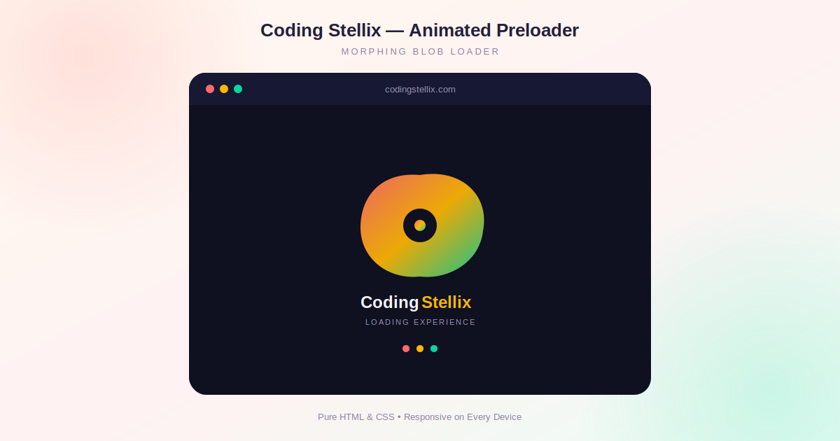
A preloader is one of those small design details that most visitors never consciously notice, yet its absence is felt immediately. Without one, a page either flashes blank white for a moment or suddenly pops into view with everything half-loaded, which feels rough even on a fast connection. At Coding Stellix, we recently built a second version of our preloader, moving away from a simple spinning ring toward something with a bit more personality: an organic, morphing shape that constantly shifts form while the page loads behind it. This article walks through exactly how that effect works and how you can build something similar for your own site.
Deciding What Makes a Preloader Feel Good
Before writing any CSS, it helps to think about what actually makes a loading animation satisfying to watch rather than just tolerable. A plain spinning circle works, but it can feel a little sterile after you have seen it a hundred times across a hundred different websites. An animation that changes shape as it moves, the way a drop of liquid wobbles and reforms, tends to hold attention a little longer and feels more alive, even though it is running for only a second or two.
That was the starting idea behind this preloader: instead of a fixed shape rotating in place, build a shape that is constantly reforming itself, layered with color and a bit of rotation, so the whole thing feels less mechanical and more organic.
Building the Morphing Shape
The trick behind the morphing effect comes down to one CSS property most people rarely touch beyond a simple rounded corner: border-radius. Most developers only ever set a single value on this property to round off a card or a button, but border-radius actually accepts up to eight separate values, controlling each corner independently on both the horizontal and vertical axis. By defining a keyframe animation that cycles through several very different combinations of these values, a plain square element can be made to morph continuously between blob-like shapes that never look quite the same from one moment to the next.
Layered on top of that morphing animation is a slow, continuous rotation, and a background gradient that shifts its position over time as well. None of these three animations depend on each other, so they can all be declared separately and simply run at the same time on the same element, which is what gives the shape its slightly unpredictable, fluid quality rather than looking like a single repeating loop.
Adding Color With a Moving Gradient
Color plays a big role in making this kind of animation feel dynamic. Rather than filling the shape with one flat color, the background uses a linear gradient that blends through three tones, and the gradient itself is set to a size larger than the element, which allows its position to be animated. By shifting the gradient’s background position back and forth over a few seconds, the colors inside the shape appear to flow and shift even though the shape’s outline is doing its own separate morphing animation. Combined together, the effect reads as something closer to a lava lamp or a drop of colored oil than a static loading icon.
A small circular cutout sits in the center of the blob, styled to match the page background so it appears as a hole rather than a separate element, with a tiny pulsing dot inside it for an extra bit of motion at the very core of the animation.
Layering the Brand Identity On Top
Underneath the animated shape, the brand name is displayed using a similar moving gradient technique applied directly to text, using the background-clip property to let the gradient show through the letters instead of filling a solid color. This ties the loading animation and the brand name together visually, since both are using the same shifting gradient technique, just applied to different elements.
Below that, a small uppercase tagline in a muted color adds context without competing for attention, and a row of three small dots pulses in a staggered rhythm underneath everything, each one colored to match one of the three tones used throughout the animation. The slight delay between each dot’s pulse, rather than having them animate in perfect unison, is what makes that detail feel like a coherent group rather than three separate elements that happen to be moving.
Keeping It to Pure CSS
One of the deliberate constraints on this project was to build the entire animation using only HTML and CSS, without reaching for a JavaScript animation library. This keeps the file small, keeps the animation running smoothly since CSS animations are handled efficiently by the browser’s own rendering engine, and means the preloader can be dropped into virtually any website regardless of what framework or tooling that site is built with. The only JavaScript used anywhere in the file is a small handful of lines that wait for the page to finish loading and then fade the preloader out, which is really more of a visibility toggle than an animation itself.
Making Sure It Actually Feels Right in Practice
A subtle detail worth mentioning is the short artificial delay before the preloader fades away, even after the page has technically finished loading. Without this, a fast page load can cause the animation to flash on screen for a fraction of a second and then vanish, which looks more like a glitch than an intentional design choice. Giving the preloader a short guaranteed minimum display time, even if everything else loads instantly, makes the whole experience feel deliberate rather than accidental.
Final Thoughts
Building an animated preloader is a genuinely useful way to get comfortable with CSS keyframe animations, since it forces you to think about layering multiple independent animations on a single element and coordinating timing between several different pieces. The morphing border-radius technique in particular is one of those small tricks that looks far more advanced than the actual code behind it, which makes it a great addition to any developer’s toolkit.
This project reflects the kind of practical, visually polished work Coding Stellix likes to share, since it is something any developer can drop directly into their own site and adapt with their own brand colors in just a few minutes.
<!DOCTYPE html>
<html lang="en">
<head>
<meta charset="UTF-8">
<meta name="viewport" content="width=device-width, initial-scale=1.0">
<title>Coding Stellix — Animated Preloader</title>
<link rel="preconnect" href="https://fonts.googleapis.com">
<link href="https://fonts.googleapis.com/css2?family=Poppins:wght@500;600;700;800&display=swap" rel="stylesheet">
<style>
  :root{
    --bg: #0f1020;
    --coral: #ff6b6b;
    --gold: #ffb703;
    --teal: #06d6a0;
    --text: #f5f3ff;
    --muted: #9a95bd;
  }

  *{ margin:0; padding:0; box-sizing:border-box; }

  html, body{
    height:100%;
    background: var(--bg);
    font-family: 'Poppins', sans-serif;
    overflow:hidden;
  }

  /* ===== Preloader Overlay ===== */
  #stellix-preloader{
    position:fixed;
    inset:0;
    display:flex;
    flex-direction:column;
    align-items:center;
    justify-content:center;
    background:
      radial-gradient(circle at 25% 20%, rgba(255,107,107,0.16), transparent 45%),
      radial-gradient(circle at 75% 80%, rgba(6,214,160,0.14), transparent 45%),
      var(--bg);
    z-index:9999;
    transition: opacity 0.7s ease, visibility 0.7s ease;
  }
  #stellix-preloader.hidden{
    opacity:0;
    visibility:hidden;
    pointer-events:none;
  }

  /* ===== Morphing Blob ===== */
  .stellix-blob-wrap{
    position:relative;
    width:120px;
    height:120px;
    display:flex;
    align-items:center;
    justify-content:center;
    margin-bottom: 34px;
  }

  .stellix-blob{
    position:absolute;
    inset:0;
    background: linear-gradient(135deg, var(--coral), var(--gold), var(--teal));
    background-size: 200% 200%;
    animation:
      morph 4s ease-in-out infinite,
      spin 6s linear infinite,
      gradientShift 3s ease infinite;
    box-shadow: 0 0 40px rgba(255,107,107,0.35), 0 0 60px rgba(6,214,160,0.25);
  }

  @keyframes morph{
    0%,100%{ border-radius: 42% 58% 65% 35% / 45% 40% 60% 55%; }
    25%{ border-radius: 60% 40% 30% 70% / 55% 65% 35% 45%; }
    50%{ border-radius: 35% 65% 55% 45% / 40% 30% 70% 60%; }
    75%{ border-radius: 55% 45% 40% 60% / 65% 55% 45% 35%; }
  }
  @keyframes spin{
    to{ transform: rotate(360deg); }
  }
  @keyframes gradientShift{
    0%,100%{ background-position: 0% 50%; }
    50%{ background-position: 100% 50%; }
  }

  .stellix-blob-core{
    position:relative;
    z-index:2;
    width:46px;
    height:46px;
    border-radius:50%;
    background: var(--bg);
    display:flex;
    align-items:center;
    justify-content:center;
    box-shadow: inset 0 0 12px rgba(0,0,0,0.4);
  }
  .stellix-blob-core::before{
    content:'';
    width:16px;
    height:16px;
    border-radius:50%;
    background: linear-gradient(135deg, var(--coral), var(--gold));
    animation: pulse 1.4s ease-in-out infinite;
  }
  @keyframes pulse{
    0%,100%{ transform: scale(1); opacity:1; }
    50%{ transform: scale(1.3); opacity:0.7; }
  }

  /* ===== Brand Text ===== */
  .stellix-brand{
    font-size: 26px;
    font-weight: 700;
    letter-spacing: 0.5px;
    color: var(--text);
    display:flex;
    gap:2px;
  }
  .stellix-brand .word-2{
    background: linear-gradient(90deg, var(--coral), var(--gold), var(--teal));
    background-size: 200% auto;
    -webkit-background-clip: text;
    background-clip: text;
    color: transparent;
    animation: gradientShift 3s ease infinite;
  }

  .stellix-tagline{
    margin-top:10px;
    font-size:12px;
    letter-spacing: 3px;
    text-transform: uppercase;
    color: var(--muted);
  }

  /* ===== Dot progress ===== */
  .stellix-dots{
    display:flex;
    gap:8px;
    margin-top: 26px;
  }
  .stellix-dots span{
    width:8px;
    height:8px;
    border-radius:50%;
    background: var(--muted);
    opacity:0.35;
    animation: dotPulse 1.2s ease-in-out infinite;
  }
  .stellix-dots span:nth-child(1){ animation-delay: 0s; background: var(--coral); }
  .stellix-dots span:nth-child(2){ animation-delay: 0.15s; background: var(--gold); }
  .stellix-dots span:nth-child(3){ animation-delay: 0.3s; background: var(--teal); }

  @keyframes dotPulse{
    0%,100%{ transform: scale(1); opacity:0.35; }
    50%{ transform: scale(1.5); opacity:1; }
  }

  /* ===== Demo page content behind preloader ===== */
  .stellix-demo-page{
    height:100%;
    display:flex;
    align-items:center;
    justify-content:center;
    color: var(--text);
    text-align:center;
    padding: 20px;
  }
  .stellix-demo-page h1{
    font-size: 32px;
    font-weight:700;
  }
  .stellix-demo-page p{
    color: var(--muted);
    margin-top:10px;
    font-size:15px;
  }
</style>
</head>
<body>

  <!-- PRELOADER -->
  <div id="stellix-preloader">
    <div class="stellix-blob-wrap">
      <div class="stellix-blob"></div>
      <div class="stellix-blob-core"></div>
    </div>
    <div class="stellix-brand">Coding <span class="word-2">Stellix</span></div>
    <div class="stellix-tagline">Loading Experience</div>
    <div class="stellix-dots">
      <span></span><span></span><span></span>
    </div>
  </div>

  <!-- PAGE CONTENT (shown after preload) -->
  <div class="stellix-demo-page">
    <div>
      <h1>Coding Stellix</h1>
      <p>Your website content goes here.</p>
    </div>
  </div>

  <script>
    // Hide preloader once page has fully loaded
    window.addEventListener('load', function () {
      setTimeout(function () {
        var preloader = document.getElementById('stellix-preloader');
        preloader.classList.add('hidden');
        setTimeout(function(){ preloader.remove(); }, 800);
      }, 1800); // minimum display time so animation is visible
    });
  </script>

</body>
</html>