
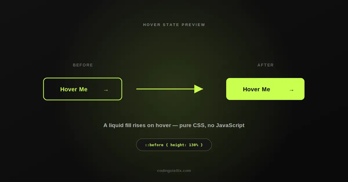
Buttons are one of the smallest elements on any website, and also one of the easiest to get wrong. A button that just changes color on hover works, but it rarely makes anyone stop and notice. A button that feels like liquid pouring into it from the bottom, on the other hand, tends to get remembered. This walkthrough explains exactly how that effect is built, using nothing but HTML and CSS — no JavaScript, no animation library, no dependencies.
What We’re Building
The effect itself is simple to describe: a button starts as just an outline, colored text sitting inside a border with a transparent center. The moment your cursor touches it, a solid fill rises up from the bottom of the button like water filling a glass, and the text color instantly flips to stay readable against the new background. A small arrow icon inside the button also nudges slightly to the right, adding a second layer of motion that reinforces the idea of moving forward.
None of this requires JavaScript. The entire animation is powered by CSS pseudo-elements and transitions, which is worth understanding on its own — it’s one of the more useful patterns in front-end work, and it shows up in dozens of other hover effects once you know the trick.
The Core Idea: An Invisible Layer Underneath
The trick behind almost every “fill” style hover effect is the same: you’re not actually animating the button’s background color directly. Instead, you create a second layer that sits behind the button’s visible content, starts with zero height, and grows to fill the button’s full height when hovered. Because it’s positioned behind everything else and clipped to the button’s shape, it looks exactly like the button itself is filling up, even though the actual button background never changes.
Here’s the shape of the idea in plain terms. The button itself is given relative positioning so this hidden layer has something to anchor to. That hidden layer is set to sit directly behind the button, stretched across its full width, starting at zero height and anchored to the bottom edge. When the button is hovered, that height animates up to roughly the button’s full height using a smooth transition — nothing snaps into place instantly, it genuinely rises.
A few details matter more than they might seem to at first glance. The button needs its overflow hidden, so the fill layer can’t spill outside the button’s rounded corners as it grows upward. The fill layer also needs to sit strictly behind the text, which is handled by stacking order rather than by touching the text’s own layering — this avoids a common mistake where the fill accidentally ends up covering the label instead of sitting behind it. And the fill is usually animated to slightly more than 100% height rather than exactly 100%, which quietly avoids a thin visual gap sometimes appearing at the top edge due to how browsers round fractional pixels.
Getting the Text Color to Flip at the Right Moment
The second half of the effect is making the label switch from the outline color to a contrasting color exactly as the fill passes underneath it. This uses a normal color transition, but with one small refinement: a short delay before the color starts changing.
That tiny delay means the text color begins shifting just slightly after the fill starts rising, rather than at the exact same instant. It sounds like a minor detail, but it changes how the whole animation reads. Without the delay, the fill and the color change look like two separate things happening to coincide by chance. With it, the effect reads as one continuous motion — the fill rises, and the text color follows right behind it, like the fill itself is what’s causing the color to change.
Adding a Second Layer of Motion
A single moving fill already looks good, but the effect benefits from one more small touch: a directional cue on the arrow. Wrapping the arrow character in its own inline element and giving that element a small horizontal shift on hover adds a subtle “moving forward” feeling that pairs naturally with the rising fill underneath it.
This is a good general rule for hover effects worth remembering beyond this one button: one strong primary motion, paired with one small secondary motion, usually reads as more polished than either effect on its own — and far better than stacking five different animations together, which tends to look busy rather than intentional.
Finishing Touches That Make It Feel Complete
A few more small rules round out the effect. A gentle upward lift combined with a soft colored glow underneath the button on hover gives it a sense of physical weight, as if it’s rising slightly off the page toward the cursor. A subtle scale-down on click makes it feel responsive to an actual press rather than just a static hover target that does nothing when interacted with. And a clearly visible focus outline for keyboard navigation ensures the button stays usable for anyone who isn’t using a mouse at all, which is easy to forget when a design leans this heavily on hover behavior.
It’s also worth respecting the people who’ve told their operating system they prefer reduced motion. Turning these transitions off for that group costs almost nothing to implement and matters a great deal to the people who specifically asked for it.
Why This Approach Is Worth Knowing
The specific colors and shape used here — a bright lime fill on a black background, a rounded rectangle, a small arrow — are just one version of this idea. The same underlying technique, a hidden layer that grows to reveal a solid fill, can be recolored, reshaped, or redirected in countless ways: fills that wipe sideways instead of rising, fills shaped like a diagonal wedge cutting across the button, fills that reveal a background image instead of a flat color. Once the core pattern clicks, it becomes one of the more reusable tricks in a front-end developer’s toolkit, precisely because it needs nothing beyond plain HTML and CSS to pull off.
The full working example is a single self-contained HTML file — open it, look at how the pieces fit together, and adapt the colors, timing, or direction to fit your own project. No build step, no dependencies, just markup and style rules doing all the work.
<!DOCTYPE html>
<html lang="en">
<head>
<meta charset="UTF-8">
<meta name="viewport" content="width=device-width, initial-scale=1.0">
<title>Button Hover Effect | Coding Stellix</title>
<link href="https://fonts.googleapis.com/css2?family=Jost:wght@400;600;700&display=swap" rel="stylesheet">
<style>
  *{margin:0;padding:0;box-sizing:border-box}
  body{
    min-height:100vh;
    display:flex;align-items:center;justify-content:center;
    background:#0a0a0a;
    font-family:'Jost',sans-serif;
  }

  .btn{
    position:relative;
    padding:18px 46px;
    font-family:inherit;
    font-size:1.05rem;
    font-weight:700;
    letter-spacing:.5px;
    color:#c8ff4d;
    background:transparent;
    border:2px solid #c8ff4d;
    border-radius:10px;
    cursor:pointer;
    overflow:hidden;
    isolation:isolate;
    display:inline-flex;
    align-items:center;
    gap:10px;
    transition:color .45s ease .05s, transform .3s ease, box-shadow .3s ease;
  }

  /* liquid fill wipes up from the bottom */
  .btn::before{
    content:"";
    position:absolute;
    left:0; right:0; bottom:-10%;
    height:0%;
    background:#c8ff4d;
    border-radius:50% 50% 0 0 / 18px 18px 0 0;
    transition:height .45s cubic-bezier(.65,0,.35,1);
    z-index:-1;
  }

  .btn .arrow{
    display:inline-block;
    transition:transform .35s ease;
  }

  .btn:hover{
    color:#0a0a0a;
    transform:translateY(-2px);
    box-shadow:0 10px 30px rgba(200,255,77,.28);
  }
  .btn:hover::before{
    height:130%;
    border-radius:0;
  }
  .btn:hover .arrow{
    transform:translateX(6px);
  }

  .btn:active{transform:translateY(0) scale(.98)}

  .btn:focus-visible{
    outline:2px solid #c8ff4d;
    outline-offset:4px;
  }

  @media (prefers-reduced-motion: reduce){
    .btn, .btn::before, .btn .arrow{transition:none}
  }
</style>
</head>
<body>
  <button class="btn">Hover Me <span class="arrow">→</span></button>
</body>
</html>