
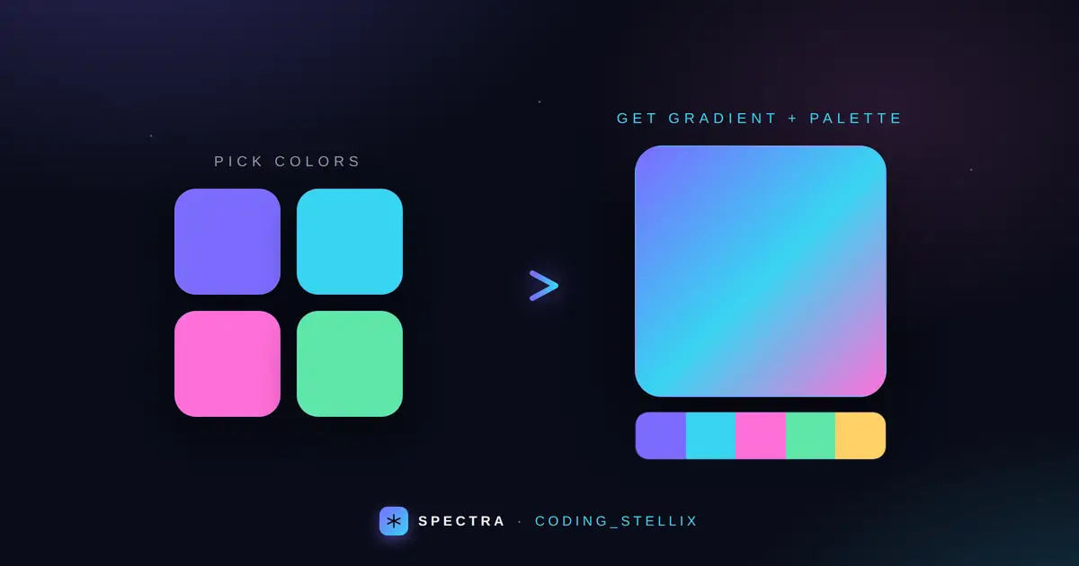
Picking colors is the part of web design that eats the most time and shows the least on the invoice. You want a gradient that feels alive, a palette that holds together, and you want the CSS ready to paste — not another twenty minutes of nudging hex values. That’s the whole reason I built Spectra for Coding_Stellix. It’s a gradient generator and color palette tool rolled into one clean studio, and it lives in a single HTML file with no frameworks, no build step, and nothing to install. Open it and you’re designing.
Spectra does two jobs really well. On top, it’s a full CSS gradient generator. Below that, it’s a fast color palette maker in the style people already love from tools like Coolors. Both work together on the same page, so you can pull a base color out of a palette, drop it into your gradient, copy the CSS, and move on. That’s the flow I wanted — quick, visual, and out of your way.
A gradient generator that gives you the exact CSS
The gradient studio is the heart of Spectra. You get a big live preview that updates the instant you touch anything, and the exact CSS sits right underneath it in a code chip you can copy with one click. No guessing what the final rule looks like — what you see is literally the background property you’ll paste into your stylesheet.
Here’s what you can control:
- Linear or radial. Flip between a linear gradient and a radial one with a single toggle. Linear is your everyday hero-section and button fill; radial is great for soft glows and spotlight backgrounds.
- Multiple color stops. Start with two colors and add more with the “+” button — up to five stops for richer, multi-tone blends. Hover any color and a small remove button appears, so trimming back down is just as fast.
- Angle control. A smooth slider takes the gradient through the full 360 degrees, and quick-tap chips (0°, 45°, 90°, 135°, 180°, 270°) jump you straight to the angles you reach for most. When you switch to radial, the angle control politely steps aside since it isn’t needed.
- One-click CSS copy. Whether from the header button or the chip on the preview, copying the gradient drops a ready-to-use
background: linear-gradient(...)(orradial-gradient(...)) onto your clipboard, and a little toast confirms it landed.
The point of all this isn’t to bury you in options. It’s to let you land on something good in seconds and leave with production-ready code.
A color palette maker that actually keeps up
Under the gradient studio, Spectra generates a five-color palette laid out as bold, full-height columns. It’s the kind of layout that makes a palette easy to read at a glance and easy to fall in love with. Tap any color and its hex code copies straight to your clipboard — no menus, no dialog boxes.
The feature that makes it genuinely useful, though, is the lock. When a color clicks for you, hover it and hit the lock icon. Now when you generate a new palette — either with the button or by tapping the spacebar — the locked colors stay put while everything around them reshuffles. That’s how you build a scheme in real life: find one anchor color you like, then explore what pairs with it, one refresh at a time, until the whole set feels right.
The colors aren’t random noise either. Spectra generates them in HSL with sensible saturation and lightness ranges, so you get vibrant, balanced tones instead of muddy or washed-out ones. Every hex is displayed in a clean monospaced label with automatic contrast — light text on dark colors, dark text on light ones — so it stays readable no matter what the palette throws up.
Built to work on every device
A color tool you can only use at your desk isn’t much of a tool. Spectra is fully responsive and rethinks its layout as the screen shrinks. On desktop, the gradient preview and its control panel sit side by side, and the palette spreads out as five tall columns. On a phone, the studio stacks into a single column and the palette flips into horizontal color bands you can tap through with your thumb — the same quick, tactile experience, just shaped for a small screen. Whether you’re sketching an idea on your laptop or grabbing a hex on your phone between meetings, it behaves.
No libraries, no accounts, no clutter
Spectra is deliberately lightweight. It’s one self-contained HTML file with all the CSS and JavaScript inside it — no external gradient library, no color framework, no sign-up wall, and no ads. That has real advantages: it loads instantly, it works offline once the page is open, and you can host it anywhere or just double-click it locally. If you’re learning front-end development, it’s also a clean file to study, since everything that makes it work is right there in front of you.
The typography leans on Jost, a geometric sans-serif that keeps the interface calm and modern, and the whole studio wears a cool violet-and-cyan theme on a deep indigo background — easy on the eyes during long design sessions and a nice neutral backdrop that lets your colors do the talking.
Who Spectra is for
- Front-end developers who want gradient and palette CSS without breaking flow.
- Web and UI designers exploring color directions for a landing page, app, or brand.
- Students and hobbyists learning how CSS gradients and color values actually work.
- Content creators and marketers who need a quick, good-looking color scheme for graphics, thumbnails, or social posts.
If you’ve ever opened five tabs just to settle on two colors, this is the tool that closes four of them.
How to use it
There’s nothing to set up. Open the page, and you’re greeted with a live gradient and a fresh palette. Adjust the stops and angle until the gradient feels right, then copy the CSS. Scroll to the palette, lock the colors you love, and tap the spacebar to explore variations around them. Click any swatch to copy its hex. Hit “Randomize” any time you want a completely new starting point for both the gradient and the palette at once. That’s the entire learning curve — about ten seconds.
A note from Coding_Stellix
Every tool I release under the Coding_Stellix name is hand-built and hand-tested, and Spectra is no exception. I wanted something I’d actually keep open in a tab while working — fast, focused, and pleasant to look at — rather than another bloated generator. If it saves you even a few minutes on your next project, it’s doing its job. Take it, use it, and make something colorful.
<!DOCTYPE html>
<html lang="en">
<head>
<meta charset="UTF-8">
<meta name="viewport" content="width=device-width, initial-scale=1.0">
<title>Spectra — Gradient & Color Studio · Coding_Stellix</title>
<link rel="preconnect" href="https://fonts.googleapis.com">
<link rel="preconnect" href="https://fonts.gstatic.com" crossorigin>
<link href="https://fonts.googleapis.com/css2?family=Jost:wght@300;400;500;600;700&family=JetBrains+Mono:wght@500&display=swap" rel="stylesheet">
<style>
:root{
--bg:#0a0c18; --panel:#111531; --panel-2:#191e42; --glass:rgba(20,24,58,.6);
--line:rgba(140,150,255,.16); --text:#eef0ff; --dim:rgba(238,240,255,.55);
--violet:#7c6cff; --cyan:#38d4f2; --pink:#ff6fd8;
--grad:linear-gradient(115deg,var(--violet),var(--cyan));
}
*{margin:0;padding:0;box-sizing:border-box}
html,body{min-height:100%}
body{
font-family:'Jost',sans-serif;color:var(--text);min-height:100vh;display:flex;flex-direction:column;
background:
radial-gradient(900px 520px at 6% -14%, rgba(124,108,255,.16), transparent 60%),
radial-gradient(820px 480px at 104% 114%, rgba(56,212,242,.14), transparent 55%),
radial-gradient(600px 400px at 80% 30%, rgba(255,111,216,.08), transparent 60%),
var(--bg);
}
header{
display:flex;align-items:center;justify-content:space-between;gap:14px;
padding:16px 24px;border-bottom:1px solid var(--line);
background:rgba(10,12,24,.6);backdrop-filter:blur(10px);position:sticky;top:0;z-index:20;flex-wrap:wrap;
}
.brand{display:flex;align-items:center;gap:13px}
.logo{width:38px;height:38px;border-radius:11px;display:grid;place-items:center;
background:var(--grad);box-shadow:0 6px 20px rgba(124,108,255,.5);position:relative}
.logo svg{width:20px;height:20px}
.brand .name{font-weight:600;font-size:20px;letter-spacing:.01em;
background:linear-gradient(115deg,#fff,#c9c4ff);-webkit-background-clip:text;background-clip:text;color:transparent}
.brand .tag{font-size:10.5px;letter-spacing:.24em;text-transform:uppercase;color:var(--dim)}
.brand .tag b{color:var(--cyan);font-weight:500}
.btnrow{display:flex;gap:10px;flex-wrap:wrap}
button.btn{font-family:'Jost',sans-serif;font-size:14px;font-weight:500;letter-spacing:.03em;
color:var(--text);background:var(--panel-2);border:1px solid var(--line);border-radius:11px;
padding:11px 17px;cursor:pointer;display:inline-flex;align-items:center;gap:8px;transition:.2s}
button.btn:hover{border-color:rgba(124,108,255,.6);transform:translateY(-1px)}
button.btn.primary{background:var(--grad);color:#0a0c18;border-color:transparent;font-weight:600}
button.btn.primary:hover{box-shadow:0 8px 24px rgba(124,108,255,.5)}
button.btn svg{width:16px;height:16px;flex:none}
main{flex:1;max-width:1120px;width:100%;margin:0 auto;padding:28px 20px 60px;display:flex;flex-direction:column;gap:30px}
.eyebrow{font-size:12px;letter-spacing:.24em;text-transform:uppercase;color:var(--dim);margin-bottom:14px;display:flex;align-items:center;gap:10px}
.eyebrow::after{content:"";flex:1;height:1px;background:var(--line)}
/* ---- gradient studio ---- */
.studio{display:grid;grid-template-columns:1.35fr 1fr;gap:20px}
.preview{position:relative;border-radius:22px;min-height:340px;overflow:hidden;
border:1px solid var(--line);box-shadow:0 28px 70px rgba(0,0,0,.5);transition:background .55s ease}
.preview .badge{position:absolute;top:16px;left:18px;font-size:12px;letter-spacing:.18em;text-transform:uppercase;
color:rgba(255,255,255,.9);background:rgba(0,0,0,.28);backdrop-filter:blur(6px);padding:7px 14px;border-radius:999px}
.preview .csschip{position:absolute;left:16px;right:16px;bottom:16px;display:flex;align-items:center;gap:10px;
background:rgba(10,12,24,.72);backdrop-filter:blur(10px);border:1px solid var(--line);border-radius:13px;padding:11px 13px}
.preview .csschip code{font-family:'JetBrains Mono',monospace;font-size:12.5px;color:var(--cyan);
white-space:nowrap;overflow:auto;flex:1}
.preview .csschip button{flex:none;font-size:12.5px;padding:7px 12px;border-radius:8px;border:none;cursor:pointer;
background:var(--grad);color:#0a0c18;font-weight:600;font-family:'Jost',sans-serif}
.panel{background:var(--glass);backdrop-filter:blur(10px);border:1px solid var(--line);border-radius:22px;
padding:20px;display:flex;flex-direction:column;gap:20px}
.field label{font-size:12px;letter-spacing:.16em;text-transform:uppercase;color:var(--dim);display:block;margin-bottom:11px}
.seg{display:flex;background:var(--panel);border:1px solid var(--line);border-radius:11px;padding:4px;gap:4px}
.seg button{flex:1;font-family:'Jost',sans-serif;font-size:13.5px;font-weight:500;color:var(--dim);
background:transparent;border:none;border-radius:8px;padding:9px;cursor:pointer;transition:.2s}
.seg button.active{background:var(--grad);color:#0a0c18;font-weight:600}
.stops{display:flex;flex-wrap:wrap;gap:12px;align-items:center}
.stop{position:relative}
.stop input[type=color]{width:50px;height:50px;border:none;border-radius:14px;background:none;cursor:pointer;padding:0}
.stop input[type=color]::-webkit-color-swatch-wrapper{padding:0}
.stop input[type=color]::-webkit-color-swatch{border:2px solid var(--line);border-radius:14px}
.stop .rm{position:absolute;top:-7px;right:-7px;width:20px;height:20px;border-radius:50%;border:none;
background:#ff5470;color:#fff;font-size:12px;line-height:1;cursor:pointer;display:none;place-items:center}
.stop:hover .rm{display:grid}
.addstop{width:50px;height:50px;border-radius:14px;border:1.5px dashed var(--line);background:transparent;
color:var(--dim);font-size:22px;cursor:pointer;transition:.2s}
.addstop:hover{border-color:var(--violet);color:var(--violet)}
.angle-wrap[data-off=true]{opacity:.35;pointer-events:none}
.angle-row{display:flex;align-items:center;gap:12px}
.angle-row input[type=range]{flex:1;accent-color:var(--violet)}
.angle-row .val{font-family:'JetBrains Mono',monospace;font-size:13px;color:var(--text);width:46px;text-align:right}
.chips{display:flex;gap:7px;margin-top:11px;flex-wrap:wrap}
.chips button{font-family:'JetBrains Mono',monospace;font-size:12px;color:var(--dim);background:var(--panel);
border:1px solid var(--line);border-radius:8px;padding:6px 10px;cursor:pointer;transition:.2s}
.chips button:hover{color:var(--text);border-color:var(--violet)}
/* ---- palette (coolors-style) ---- */
.palette{display:flex;border-radius:20px;overflow:hidden;height:300px;border:1px solid var(--line);
box-shadow:0 22px 60px rgba(0,0,0,.45)}
.col{flex:1;position:relative;cursor:pointer;transition:flex-grow .35s ease}
.col:hover{flex-grow:1.35}
.col .lock{position:absolute;top:14px;left:50%;transform:translateX(-50%);width:34px;height:34px;border-radius:10px;
border:none;background:rgba(0,0,0,.28);backdrop-filter:blur(4px);color:#fff;cursor:pointer;display:grid;place-items:center;transition:.2s;opacity:0}
.col:hover .lock{opacity:1}
.col.locked .lock{opacity:1;background:#fff;color:#111}
.col .cinfo{position:absolute;left:0;right:0;bottom:0;padding:16px 8px;text-align:center;
display:flex;flex-direction:column;align-items:center;gap:4px}
.col .cinfo .hex{font-family:'JetBrains Mono',monospace;font-size:14px;font-weight:500;letter-spacing:.02em}
.col .cinfo .cp{font-size:10.5px;letter-spacing:.16em;text-transform:uppercase;opacity:.7;display:flex;align-items:center;gap:5px}
.hint{text-align:center;color:var(--dim);font-size:13.5px;margin-top:16px}
.hint kbd{font-family:'JetBrains Mono',monospace;background:var(--panel-2);border:1px solid var(--line);
border-radius:6px;padding:2px 8px;color:var(--cyan)}
.toast{position:fixed;bottom:26px;left:50%;transform:translateX(-50%) translateY(20px);
background:var(--grad);color:#0a0c18;font-weight:600;padding:12px 24px;border-radius:999px;
box-shadow:0 14px 34px rgba(124,108,255,.55);opacity:0;pointer-events:none;transition:.3s;z-index:60}
.toast.show{opacity:1;transform:translateX(-50%) translateY(0)}
footer{text-align:center;padding:22px;color:var(--dim);font-size:12px;letter-spacing:.26em;
text-transform:uppercase;border-top:1px solid var(--line)}
footer span{color:var(--cyan)}
@media (max-width:880px){
.studio{grid-template-columns:1fr}
.preview{min-height:260px}
}
@media (max-width:640px){
.palette{flex-direction:column;height:auto}
.col{height:68px;flex:none}
.col:hover{flex-grow:0}
.col .lock{top:50%;left:auto;right:14px;transform:translateY(-50%);opacity:1}
.col .cinfo{flex-direction:row;justify-content:flex-start;gap:12px;left:18px;right:60px;bottom:auto;top:50%;transform:translateY(-50%);text-align:left}
.col .cinfo .cp{display:none}
.brand .tag{display:none}
}
</style>
</head>
<body>
<header>
<div class="brand">
<div class="logo">
<svg viewBox="0 0 24 24" fill="none" stroke="#0a0c18" stroke-width="2.2" stroke-linecap="round" stroke-linejoin="round"><path d="M12 3v18"/><path d="M3 8l18 8"/><path d="M21 8L3 16"/></svg>
</div>
<div>
<div class="name">Spectra</div>
<div class="tag">Gradient & Color Studio · <b>Coding_Stellix</b></div>
</div>
</div>
<div class="btnrow">
<button class="btn" id="copyCss">
<svg viewBox="0 0 24 24" fill="none" stroke="currentColor" stroke-width="2" stroke-linecap="round" stroke-linejoin="round"><rect x="9" y="9" width="13" height="13" rx="2"/><path d="M5 15H4a2 2 0 0 1-2-2V4a2 2 0 0 1 2-2h9a2 2 0 0 1 2 2v1"/></svg>
Copy CSS
</button>
<button class="btn primary" id="randAll">
<svg viewBox="0 0 24 24" fill="none" stroke="currentColor" stroke-width="2" stroke-linecap="round" stroke-linejoin="round"><path d="M3 12a9 9 0 1 0 3-6.7L3 8"/><path d="M3 3v5h5"/></svg>
Randomize
</button>
</div>
</header>
<main>
<!-- Gradient studio -->
<section>
<div class="eyebrow">Gradient</div>
<div class="studio">
<div class="preview" id="preview">
<span class="badge" id="badge">Linear · 135°</span>
<div class="csschip">
<code id="cssText">background: ...</code>
<button id="copyCss2">Copy</button>
</div>
</div>
<div class="panel">
<div class="field">
<label>Type</label>
<div class="seg" id="typeSeg">
<button class="active" data-t="linear">Linear</button>
<button data-t="radial">Radial</button>
</div>
</div>
<div class="field">
<label>Colors</label>
<div class="stops" id="stops"></div>
</div>
<div class="field angle-wrap" id="angleWrap">
<label>Angle</label>
<div class="angle-row">
<input type="range" id="angle" min="0" max="360" value="135">
<span class="val" id="angleVal">135°</span>
</div>
<div class="chips" id="angleChips"></div>
</div>
</div>
</div>
</section>
<!-- Palette -->
<section>
<div class="eyebrow">Palette</div>
<div class="palette" id="palette"></div>
<p class="hint">Tap a color to copy · hover to lock 🔒 · press <kbd>Space</kbd> for a new palette</p>
</section>
</main>
<footer>Crafted by <span>Coding_Stellix</span></footer>
<div class="toast" id="toast">Copied!</div>
<script>
const rnd=(a,b)=>Math.floor(Math.random()*(b-a+1))+a;
const toHex=(r,g,b)=>'#'+[r,g,b].map(x=>x.toString(16).padStart(2,'0')).join('').toUpperCase();
function hslToHex(h,s,l){s/=100;l/=100;const k=n=>(n+h/30)%12;const a=s*Math.min(l,1-l);
const f=n=>l-a*Math.max(-1,Math.min(k(n)-3,Math.min(9-k(n),1)));
return toHex(Math.round(f(0)*255),Math.round(f(8)*255),Math.round(f(4)*255));}
const randHex=()=>hslToHex(rnd(0,360),rnd(58,95),rnd(46,66));
function contrast(hex){const r=parseInt(hex.slice(1,3),16),g=parseInt(hex.slice(3,5),16),b=parseInt(hex.slice(5,7),16);
return (r*299+g*587+b*114)/1000>140?'#0a0c18':'#ffffff';}
const toastEl=document.getElementById('toast');
function toast(msg){toastEl.textContent=msg;toastEl.classList.add('show');
clearTimeout(toastEl._t);toastEl._t=setTimeout(()=>toastEl.classList.remove('show'),1300);}
function copy(text,label){(navigator.clipboard?navigator.clipboard.writeText(text):Promise.reject())
.then(()=>toast((label||text)+' copied!')).catch(()=>toast('Copy failed'));}
// ---------- gradient state ----------
let type='linear';
let stops=['#7C6CFF','#38D4F2'];
let angle=135;
function gradientCss(){
return type==='linear'
? `linear-gradient(${angle}deg, ${stops.join(', ')})`
: `radial-gradient(circle at center, ${stops.join(', ')})`;
}
function paint(){
const g=gradientCss();
document.getElementById('preview').style.background=g;
document.getElementById('cssText').textContent='background: '+g+';';
document.getElementById('badge').textContent =
type==='linear' ? `Linear · ${angle}°` : 'Radial';
document.getElementById('angleWrap').dataset.off = (type!=='linear');
}
function renderStops(){
const wrap=document.getElementById('stops');wrap.innerHTML='';
stops.forEach((c,i)=>{
const d=document.createElement('div');d.className='stop';
d.innerHTML=`<input type="color" value="${c}">`+(stops.length>2?`<button class="rm" title="Remove">×</button>`:'');
d.querySelector('input').addEventListener('input',e=>{stops[i]=e.target.value.toUpperCase();paint();});
const rm=d.querySelector('.rm');
if(rm)rm.addEventListener('click',()=>{stops.splice(i,1);renderStops();paint();});
wrap.appendChild(d);
});
if(stops.length<5){
const add=document.createElement('button');add.className='addstop';add.textContent='+';add.title='Add color';
add.addEventListener('click',()=>{stops.push(randHex());renderStops();paint();});
wrap.appendChild(add);
}
}
// type toggle
document.getElementById('typeSeg').addEventListener('click',e=>{
const b=e.target.closest('button');if(!b)return;
type=b.dataset.t;
[...e.currentTarget.children].forEach(x=>x.classList.toggle('active',x===b));
paint();
});
// angle
document.getElementById('angle').addEventListener('input',e=>{
angle=+e.target.value;document.getElementById('angleVal').textContent=angle+'°';paint();});
const chipWrap=document.getElementById('angleChips');
[0,45,90,135,180,270].forEach(a=>{
const c=document.createElement('button');c.textContent=a+'°';
c.addEventListener('click',()=>{angle=a;document.getElementById('angle').value=a;
document.getElementById('angleVal').textContent=a+'°';paint();});
chipWrap.appendChild(c);
});
// copy css
const copyGrad=()=>copy('background: '+gradientCss()+';','CSS');
document.getElementById('copyCss').addEventListener('click',copyGrad);
document.getElementById('copyCss2').addEventListener('click',copyGrad);
function randomGradient(){
type=Math.random()<0.78?'linear':'radial';
[...document.getElementById('typeSeg').children].forEach(x=>x.classList.toggle('active',x.dataset.t===type));
stops=Array.from({length:rnd(2,3)},randHex);
angle=rnd(0,360);
document.getElementById('angle').value=angle;
document.getElementById('angleVal').textContent=angle+'°';
renderStops();paint();
}
// ---------- palette ----------
let palette=Array.from({length:5},()=>({hex:randHex(),locked:false}));
function renderPalette(){
const wrap=document.getElementById('palette');wrap.innerHTML='';
palette.forEach((p,i)=>{
const fg=contrast(p.hex);
const col=document.createElement('div');
col.className='col'+(p.locked?' locked':'');
col.style.background=p.hex;
col.innerHTML=`
<button class="lock" style="color:${p.locked?'#111':fg}">
${p.locked
? '<svg width="15" height="15" viewBox="0 0 24 24" fill="none" stroke="currentColor" stroke-width="2"><rect x="5" y="11" width="14" height="10" rx="2"/><path d="M8 11V7a4 4 0 0 1 8 0v4"/></svg>'
: '<svg width="15" height="15" viewBox="0 0 24 24" fill="none" stroke="currentColor" stroke-width="2"><rect x="5" y="11" width="14" height="10" rx="2"/><path d="M8 11V7a4 4 0 0 1 8 0"/></svg>'}
</button>
<div class="cinfo" style="color:${fg}">
<span class="hex">${p.hex}</span>
<span class="cp">Copy</span>
</div>`;
col.addEventListener('click',ev=>{if(ev.target.closest('.lock'))return;copy(p.hex,p.hex);});
col.querySelector('.lock').addEventListener('click',ev=>{ev.stopPropagation();
palette[i].locked=!palette[i].locked;renderPalette();});
wrap.appendChild(col);
});
}
function newPalette(){palette=palette.map(p=>p.locked?p:{hex:randHex(),locked:false});renderPalette();}
document.getElementById('randAll').addEventListener('click',()=>{randomGradient();newPalette();});
document.addEventListener('keydown',e=>{
if(e.code==='Space'&&e.target.tagName!=='INPUT'&&e.target.tagName!=='BUTTON'){e.preventDefault();newPalette();}});
// boot
renderStops();paint();renderPalette();
</script>
</body>
</html>