
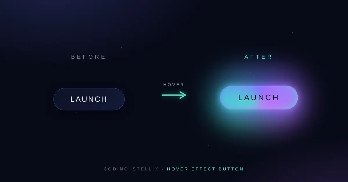
Every project I share on Coding_Stellix starts with one small question: can I make a plain thing feel alive? This button began exactly there. It’s a single “Launch” button sitting on a dark, starry background — but the moment your cursor touches it, an aurora sweeps across the surface, a soft glow ring wakes up behind it, and the whole thing lifts off the page like it’s about to take off. No images, no libraries, no JavaScript. Just clean HTML and CSS in one file that you can drop into any project today.
I built the entire thing in a single .html file on purpose. If you’ve ever tried to learn from a tutorial where the code is split across four files and three folders, you already know the pain. Here, the markup and the styling live together. You open the file, you read it top to bottom, and you understand how the effect works before you’ve even scrolled twice. Copy it, paste it, and it runs — that’s the whole idea.
What the hover effect actually does
Most “animated buttons” you find online just change color on hover and call it a day. This one layers a few small motions so the result feels intentional instead of flat. When you hover:
- An aurora gradient fill slides in from the left with a slight skew, moving from deep blue into violet and finishing on a mint-green edge. It doesn’t just appear — it sweeps, so your eye follows the motion across the button.
- A rotating conic glow ring fades in behind the button. It’s blurred and always spinning, which gives the button that “powered on” look without being loud about it.
- The button lifts and scales up a touch, and the letters spread apart as the spacing widens. That tiny bit of letter-spacing change is what makes the whole interaction feel premium.
- On press, it settles back down with a quick tactile dip, so clicking actually feels like clicking.
None of these effects fight each other. They fire together on a single hover and read as one clean moment rather than five separate tricks stacked on top of each other. That restraint is what separates a button that looks designed from one that looks like every free snippet on the internet.
Built with the Jost font for a clean, modern feel
Typography quietly decides whether an interface looks cheap or considered. For this button I went with Jost, a geometric sans-serif with a calm, contemporary shape that pairs beautifully with a dark, techy background. The uppercase label, the widened letter-spacing, and the light-weight heading above the button all lean on Jost to hold the design together. It’s loaded straight from Google Fonts, so there’s nothing to install — the font just works the moment the page loads.
Fully responsive on every device
A button that only looks good on a desktop isn’t finished. This one is built mobile-first and scales cleanly across phones, tablets, and large screens. Instead of hard-coded pixel sizes, the font size, padding, and headings all use fluid clamp() values, so the button breathes with the viewport instead of breaking at awkward widths. On a small phone the padding tightens up and the spacing relaxes so nothing feels cramped; on a wide monitor everything scales up gracefully. Test it by dragging your browser window narrow and wide — the button stays comfortable the whole way.
Accessible and thoughtful by default
Good motion should never come at the cost of usability, so I built a few quiet guarantees into this snippet:
- Keyboard users get the full effect. The same aurora and glow animation triggers on
:focus-visible, not just on mouse hover, so someone tabbing through the page sees exactly what a mouse user sees. That’s a detail most snippets skip entirely. - Reduced motion is respected. If a visitor has “reduce motion” turned on in their system settings, the drifting starfield and the spinning ring quietly switch off. The button still works and still looks good — it just stops moving for people who prefer it that way.
- No layout shift, no jank. Every animation runs on
transformandopacity, the two properties browsers handle most smoothly, so the effect stays buttery even on modest hardware.
Why pure CSS instead of JavaScript
You genuinely don’t need JavaScript for an effect like this, and adding it would only make the button heavier and slower. Everything here — the sliding fill, the glow ring, the lift, the starfield drift — is handled with CSS transitions, pseudo-elements (::before and ::after), and keyframe animations. The payoff is real: the file is tiny, it loads instantly, it works in every modern browser, and there’s nothing to break. When your hover effect is this small and self-contained, dropping it into an existing site is painless.
Where you can use this button
Because it’s a single self-contained file with zero dependencies, this animated button fits almost anywhere:
- A hero call-to-action on a landing page or portfolio
- A “Get Started,” “Sign Up,” or “Contact” button on a startup or SaaS site
- A download or launch button for an app or game
- A striking element in your own coding tutorial or CodePen demo
- A learning reference if you’re studying how CSS hover animations, pseudo-elements, and keyframes actually work together
Change the label from “Launch” to whatever your project needs, swap the gradient colors to match your brand, and you’ve got a button that feels custom-made rather than borrowed.
How to use it
There’s really nothing to configure. Save the file as index.html, double-click to open it in any browser, and the button is live. Want it in your own project? Copy the <button> markup and the .stellix-btn CSS block, paste them into your page, make sure the Jost font link is in your <head>, and you’re set. The colors are all defined as CSS variables at the top, so recoloring the whole thing to fit your palette takes about thirty seconds.
A note on the code
I write and test every snippet by hand before it goes out under the Coding_Stellix name. This one is clean, commented where it counts, and structured so you can actually learn from it — not just copy it and move on. If you’re getting comfortable with CSS, this is a great little file to pick apart: study how the two pseudo-elements stack behind the button, how the skewed gradient creates that diagonal sweep, and how a single transition line ties multiple properties into one smooth motion.
If this button helps your project, that’s the whole point. Take it, remix it, and make it yours.
<!DOCTYPE html>
<html lang="en">
<head>
<meta charset="UTF-8">
<meta name="viewport" content="width=device-width, initial-scale=1.0">
<title>Coding_Stellix — Animated Button</title>
<link rel="preconnect" href="https://fonts.googleapis.com">
<link rel="preconnect" href="https://fonts.gstatic.com" crossorigin>
<link href="https://fonts.googleapis.com/css2?family=Jost:wght@300;400;500;600;700&display=swap" rel="stylesheet">
<style>
  :root{
    --void:#070a17;
    --deep:#0d1226;
    --star:#eef1ff;
    --glow:#6c7bff;
    --glow-2:#c86bff;
    --accent:#38f2c4;
    --dim:rgba(238,241,255,.55);
  }

  *{margin:0;padding:0;box-sizing:border-box}

  html,body{height:100%}

  body{
    font-family:'Jost',sans-serif;
    background:
      radial-gradient(1200px 600px at 20% -10%, rgba(108,123,255,.18), transparent 60%),
      radial-gradient(900px 500px at 90% 110%, rgba(200,107,255,.14), transparent 55%),
      var(--void);
    color:var(--star);
    min-height:100vh;
    display:flex;
    flex-direction:column;
    align-items:center;
    justify-content:center;
    gap:clamp(1.8rem,5vw,3rem);
    padding:2rem 1.25rem;
    overflow-x:hidden;
  }

  /* drifting starfield */
  body::before{
    content:"";
    position:fixed;
    inset:0;
    background-image:
      radial-gradient(1.4px 1.4px at 15% 30%, #fff, transparent),
      radial-gradient(1.2px 1.2px at 70% 20%, #cdd6ff, transparent),
      radial-gradient(1.6px 1.6px at 40% 70%, #fff, transparent),
      radial-gradient(1px 1px at 85% 60%, #b8c0ff, transparent),
      radial-gradient(1.3px 1.3px at 55% 45%, #fff, transparent),
      radial-gradient(1px 1px at 25% 85%, #dfe4ff, transparent);
    opacity:.5;
    animation:drift 22s linear infinite;
    pointer-events:none;
  }
  @keyframes drift{
    from{transform:translateY(0)}
    to{transform:translateY(-40px)}
  }

  .brand{
    text-align:center;
    z-index:1;
  }
  .brand .eyebrow{
    font-size:.72rem;
    letter-spacing:.42em;
    text-transform:uppercase;
    color:var(--accent);
    font-weight:500;
  }
  .brand h1{
    font-weight:300;
    font-size:clamp(1.5rem,6vw,2.6rem);
    letter-spacing:.02em;
    margin-top:.5rem;
    line-height:1.15;
  }
  .brand h1 b{font-weight:600}

  /* ===== The signature button ===== */
  .stellix-btn{
    position:relative;
    font-family:'Jost',sans-serif;
    font-size:clamp(1rem,3.5vw,1.15rem);
    font-weight:500;
    letter-spacing:.14em;
    text-transform:uppercase;
    color:var(--star);
    background:linear-gradient(135deg, var(--deep), #131a38);
    border:1px solid rgba(108,123,255,.4);
    border-radius:999px;
    padding:1.05em 2.6em;
    cursor:pointer;
    overflow:hidden;
    isolation:isolate;
    z-index:1;
    transition:transform .45s cubic-bezier(.2,.9,.25,1),
               box-shadow .45s ease,
               letter-spacing .45s ease,
               border-color .45s ease;
    box-shadow:0 8px 30px rgba(0,0,0,.45);
  }

  /* sliding aurora fill */
  .stellix-btn::before{
    content:"";
    position:absolute;
    inset:0;
    z-index:-1;
    background:linear-gradient(115deg,var(--glow),var(--glow-2) 55%,var(--accent));
    transform:translateX(-101%) skewX(-12deg);
    transition:transform .55s cubic-bezier(.2,.9,.25,1);
  }

  /* rotating glow ring */
  .stellix-btn::after{
    content:"";
    position:absolute;
    inset:-2px;
    z-index:-2;
    border-radius:inherit;
    background:conic-gradient(from 0deg,var(--glow),var(--glow-2),var(--accent),var(--glow));
    filter:blur(9px);
    opacity:0;
    transition:opacity .45s ease;
    animation:spin 4s linear infinite;
  }
  @keyframes spin{to{transform:rotate(360deg)}}

  .stellix-btn .label{position:relative;display:inline-block}

  .stellix-btn:hover,
  .stellix-btn:focus-visible{
    transform:translateY(-4px) scale(1.03);
    letter-spacing:.2em;
    border-color:transparent;
    color:#0a0d1c;
    box-shadow:0 18px 45px rgba(108,123,255,.45);
    outline:none;
  }
  .stellix-btn:hover::before,
  .stellix-btn:focus-visible::before{transform:translateX(0) skewX(-12deg)}
  .stellix-btn:hover::after,
  .stellix-btn:focus-visible::after{opacity:.85}
  .stellix-btn:active{transform:translateY(-1px) scale(.99)}

  .foot{
    position:fixed;
    bottom:1.1rem;
    font-size:.72rem;
    letter-spacing:.3em;
    text-transform:uppercase;
    color:var(--dim);
    z-index:1;
  }
  .foot span{color:var(--accent)}

  @media (max-width:420px){
    .brand .eyebrow{letter-spacing:.3em}
    .stellix-btn{padding:1em 2em}
  }

  @media (prefers-reduced-motion:reduce){
    body::before,.stellix-btn::after{animation:none}
    .stellix-btn,.stellix-btn::before{transition:none}
  }
</style>
</head>
<body>

  <div class="brand">
    <p class="eyebrow">Coding_Stellix</p>
    <h1>Hover the button to <b>light the stars</b></h1>
  </div>

  <button class="stellix-btn" type="button">
    <span class="label">Launch</span>
  </button>

  <p class="foot">Crafted by <span>Coding_Stellix</span></p>

</body>
</html>